- Subscribe to RSS Feed
- Mark Topic as New
- Mark Topic as Read
- Float this Topic for Current User
- Bookmark
- Subscribe
- Mute
- Printer Friendly Page
Knowledgebase Improvements
11-06-2017 08:29 AM - edited 11-06-2017 08:41 AM
- Mark as New
- Bookmark
- Subscribe
- Mute
- Subscribe to RSS Feed
- Permalink
- Report to a Moderator
Starting this week, you may begin to see changes to Knowledgebase articles on ni.com. These changes include:
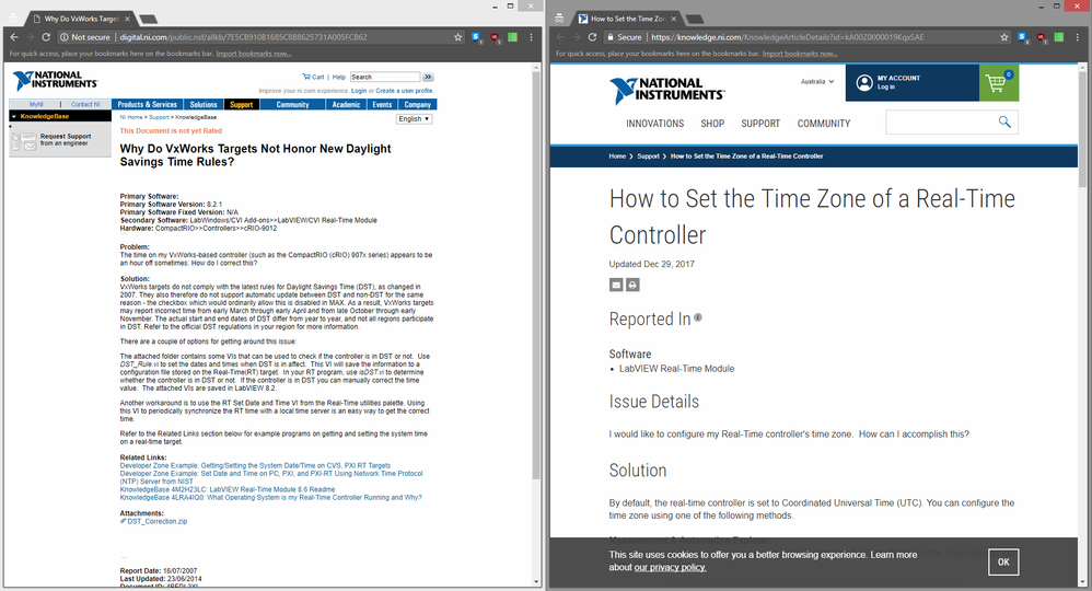
- A refreshed look and feel that is consistent with the rest of ni.com, and allows for easier readability (see image and link below)
- A responsive design, making our new knowledgebase articles mobile and tablet friendly
- New article features including a “Reported In” field that shows which products are verified to work for the solution described in the article
- Improved article relevancy
Articles will transition to this new format over the next year, beginning with English articles then followed by other languages.
If you have any questions, or feedback once you encounter the new Knowledgebase articles, please post below.
Thanks,
Christine
https://knowledge.ni.com/KnowledgeArticleDetails?id=kA00Z000000P7ZOSA0
01-16-2018 11:12 PM
- Mark as New
- Bookmark
- Subscribe
- Mute
- Subscribe to RSS Feed
- Permalink
- Report to a Moderator
The old article format does look tired and dated and in need of a refresh, but the new format swings a bit too far in the other direction.
The article header shows little information, but manages to consume almost the entire screen. Contrast with the old format which manages to fit the full problem description and solution in a single screen (links: old and new😞
Personally, mixed fonts, massively mixed font sizes, swathes of white space, and grey text on white don't contribute to easier readability. The mobile responsive design looks better, and should honestly be the default for the desktop version (it's odd that a smaller window size would show more information):
The new format also provides no detailed rating options, save for simplistic thumbs-up and thumbs-down, and doesn't seem to show what others think of the article (thumbs-up vs thumbs-down). The old 1-5 rating gave me an idea of what others thought of an article. For a topic I might've been unfamiliar with, this helped provide a guide to the reliability and quality of the information presented.
Written feedback is also gone, which was useful for reporting errors in articles. For example I found an error in a KB article today (see my post about it here), but there is no way to report the error from the KB page.
Unless otherwise stated, all code snippets and examples provided
by me are "as is", and are free to use and modify without attribution.
01-17-2018 08:12 AM
- Mark as New
- Bookmark
- Subscribe
- Mute
- Subscribe to RSS Feed
- Permalink
- Report to a Moderator
I didn't realize so much information was lost. The 5 star rating, and comments, are something I used and valued in the old system too.
Unofficial Forum Rules and Guidelines
Get going with G! - LabVIEW Wiki.
17 Part Blog on Automotive CAN bus. - Hooovahh - LabVIEW Overlord
01-17-2018 04:04 PM
- Mark as New
- Bookmark
- Subscribe
- Mute
- Subscribe to RSS Feed
- Permalink
- Report to a Moderator
Thank you both for your feedback. I am going to try to respond to your concerns individually:
Whitespace
The whitespace issue is one that we hear loud and clear, not just on KB, but other parts of the site as well. Our design team is very actively looking into this and will hopefully have an update soon.
Feedback:
There are two separate issues around feedback:
- Method of providing feedback
As you have alluded to, we have moved away from the 1-5 rating + comment box to a more simplistic thumbs up/down for KBs. The reason for this change is around engagement. The old system was very rarely used and we wanted to test if a more simplistic feedback mechanism would drive up usage. The goal is to get a baseline compare and then make adjustments like adding an open-text feedback box to see how that changes our engagement numbers. While I wholeheartedly agree that getting more granular and detailed feedback is important and the end goal, we want to make sure we are doing it in the right way and have the ability to measure the effect of these changes. In the meantime, if you have specific feedback about a KB- feel free to PM me, and I will ensure it gets looked at. (We have already updated the KB you provided feedback on in your post.)
- Displaying the feedback of others
In our old KB system, the average 1-5 rating was displayed on the KB Page. When looking into design options for our new KB system, we did usability testing with customers, specifically around this feature. The results from the testing were very consistent in pointing out that displaying this on the page was not useful and only served as a distraction. Based on those results we made the decision to pull this feature out of the external page design but still use the feedback internally to make improvements to our knowledgebase. If we start getting lots of feedback that showing this information on the page is, in fact, useful (like you both have mentioned), then we are happy to revisit this.
Hassan Atassi
Senior Group Manager, Digital Support


