- Subscribe to RSS Feed
- Mark Topic as New
- Mark Topic as Read
- Float this Topic for Current User
- Bookmark
- Subscribe
- Mute
- Printer Friendly Page
Circuit Breaker Trip Curve Chart
06-20-2013 12:46 PM
- Mark as New
- Bookmark
- Subscribe
- Mute
- Subscribe to RSS Feed
- Permalink
- Report to a Moderator
Can someone look at the circuit breaker trip curve in the attached PDFs and possibly show me how to mimic a log chart like this, with the grid lines and shading as shown?
Thanks in Advance
Tim Crouse
06-20-2013 09:59 PM - edited 06-20-2013 10:02 PM
- Mark as New
- Bookmark
- Subscribe
- Mute
- Subscribe to RSS Feed
- Permalink
- Report to a Moderator
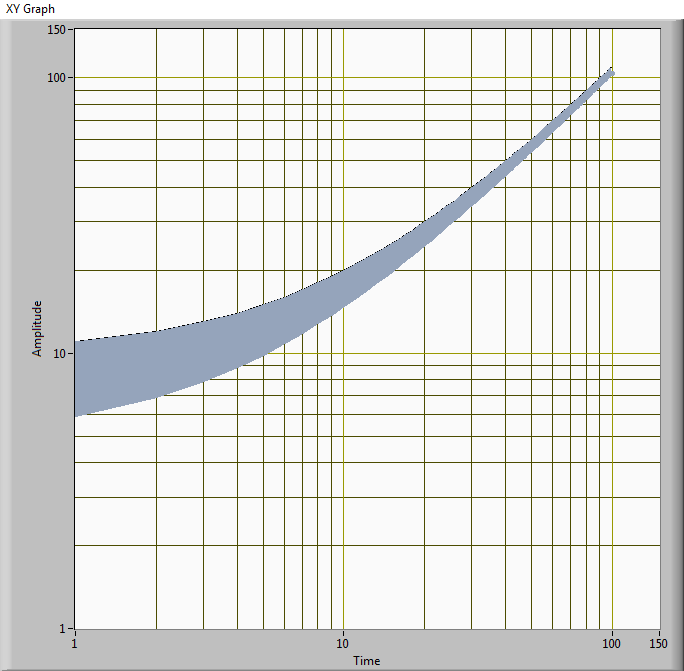
You mean something like this...?
You'll have to play with XY graph a little and feed it two arrays (one for each border). Attached is a small non-fancy vi to show how to do it.
Try this:
1. Pick XY graph (you can do this also with other indicators), set background color to whatever you want - and set X-scale and Y-scale to "log" through "properties" (right click on the graph to access it)
2. On first the first plot, set "Fill Base line" to Second plot
3. Set the first plot color to whatever color you want for your "shading" color (I have shown it with light blue)
3. On the second plot, simply make its color same as the first plot - I believe all other default values should stay the same.
You'll see that it creates the type of log chart that you want.
Good luck!
-DP
- Tags:
- LabView_XYgraph
06-21-2013 02:59 PM
- Mark as New
- Bookmark
- Subscribe
- Mute
- Subscribe to RSS Feed
- Permalink
- Report to a Moderator
Thank You
That looks AWSOME 🙂


