- Subscribe to RSS Feed
- Mark Topic as New
- Mark Topic as Read
- Float this Topic for Current User
- Bookmark
- Subscribe
- Mute
- Printer Friendly Page
Problem with changing chart "on the fly"
03-23-2015 09:03 AM
- Mark as New
- Bookmark
- Subscribe
- Mute
- Subscribe to RSS Feed
- Permalink
- Report to a Moderator
Hi
Im sampling some data "on the fly" as showed in attachment, but can't make it look as how my customer want it 😞
As you can see, I sample a (red) value. And when the value reach above a limit (green dotted line at 3), the sample above the limit shall turn color.
I also need to "mark" the highest level, with a extra width line.
I have tried a lot of different things, but always ending up with changing the color for the entire sample.
I have also tried with multiple charts, and some differrent enable/disable settings - but get stucked again.
Can anybody provide me, with a clue on how to solve this. Or even better, an example? 🙂
Many thanks..
03-23-2015 09:17 AM
- Mark as New
- Bookmark
- Subscribe
- Mute
- Subscribe to RSS Feed
- Permalink
- Report to a Moderator
You are going to have to "Cheat" just a bit.
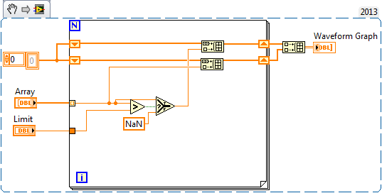
Use three plots: one will have all NaNs except for the maxima and a thick width. One will have all nans except for the values >= your threshold and the same color as the first but a thiner line. the last will contain NaNs except for the points you want the other color
"Should be" isn't "Is" -Jay
03-23-2015 09:24 AM
- Mark as New
- Bookmark
- Subscribe
- Mute
- Subscribe to RSS Feed
- Permalink
- Report to a Moderator
Here's an example with one of your requirement.
03-23-2015 09:25 AM
- Mark as New
- Bookmark
- Subscribe
- Mute
- Subscribe to RSS Feed
- Permalink
- Report to a Moderator
You also need to decide what to do when there is only one sample going over the limit.
03-23-2015 09:33 AM
- Mark as New
- Bookmark
- Subscribe
- Mute
- Subscribe to RSS Feed
- Permalink
- Report to a Moderator
Nice example!
@Michel_Gauvin wrote:
You also need to decide what to do when there is only one sample going over the limit.
Cheat again, double up every point and change the plot style back to the default.
"Should be" isn't "Is" -Jay
03-23-2015 09:36 AM
- Mark as New
- Bookmark
- Subscribe
- Mute
- Subscribe to RSS Feed
- Permalink
- Report to a Moderator
NaNs are not plotted? Well I didn't realise that! 🙂
All sorts of handy possibilities spring to mind.
03-23-2015 09:42 AM
- Mark as New
- Bookmark
- Subscribe
- Mute
- Subscribe to RSS Feed
- Permalink
- Report to a Moderator
It does afford some nifty tricks. And just how would you plot a NaN? Its not a number.
"Should be" isn't "Is" -Jay
03-23-2015 09:46 AM
- Mark as New
- Bookmark
- Subscribe
- Mute
- Subscribe to RSS Feed
- Permalink
- Report to a Moderator
Like so many things, totally obvious when you see it. Its just that that particular wood was hidden in the trees! ![]()
03-23-2015 10:19 AM
- Mark as New
- Bookmark
- Subscribe
- Mute
- Subscribe to RSS Feed
- Permalink
- Report to a Moderator
See also this very old discussion.
A chart might be a bit problematic, because in order to plot the thicker line you need more than one consecutive point above the limit and you would thus need to know the value of one point in the future. If the chart update is relatively fast, you could delat the plotting by one point, for example.

