View Ideas...
Labels
-
Add-on tools
41 -
Analysis
23 -
Compiler
36 -
Configuration
32 -
Deployment
27 -
Documentation
24 -
Drivers
9 -
Execution
27 -
Hardware connectivity
3 -
Installation
9 -
Localization
7 -
Measurement
5 -
Networking
17 -
Performance
30 -
Portability
17 -
Real-Time
10 -
Usability
240 -
User Interface
250
- « Previous
- Next »
Idea Statuses
- New 357
- Duplicate 10
- Already Implemented 9
- Under Consideration 116
- In Development 5
- Completed 32
- Declined 10
Turn on suggestions
Auto-suggest helps you quickly narrow down your search results by suggesting possible matches as you type.
Showing results for
Options
- Subscribe to RSS Feed
- Mark as New
- Mark as Read
- Bookmark
- Subscribe
- Printer Friendly Page
- Report to a Moderator
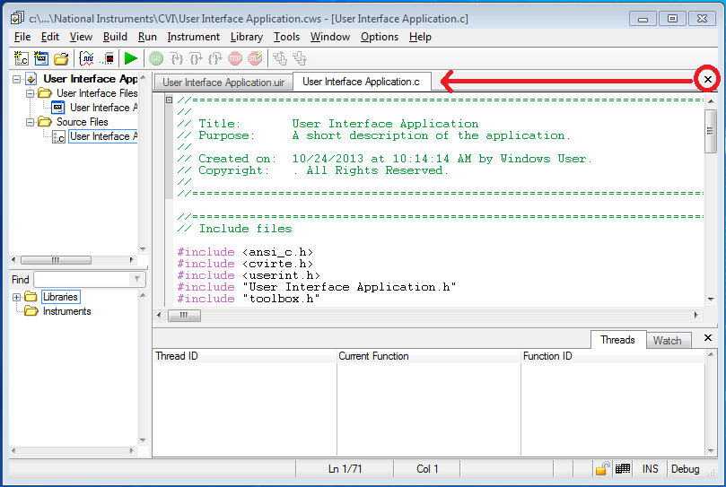
Put the X on the tab it goes with.
Submitted by
K_Joy
on
10-24-2013
10:58 AM
14 Comments (14 New)
Status:
Completed
This X just closes out of the tab that is on top.
Pretty much every other program with tabs has the X on the tab you’re closing out of. The current placement makes me hesitate every time, because it feels like you’re X-ing out of the entire code-viewing pane, not just the single file you want to close.
It’s also not consistent with the rest of the environment.
For example, in the pane on the bottom in the screenshot above, “Threads” and “Wa tch” look like two tabs, but clicking the X in that pane causes the entire pane to disappear rather than just closing the tab that is on top.
Labels:
14 Comments
You must be a registered user to add a comment. If you've already registered, sign in. Otherwise, register and sign in.


Hi K_Joy,
Thank you for the idea! This has been implemented in the latest version of LabWindows/CVI, LabWindows/CVI 2017. Feel free to go download and try out the feature: http://www.ni.com/download/labwindowscvi-full-development-system-2017/6617/en/
Thank you again for the idea - we look forward to hearing more from you!
Regards,