- Subscribe to RSS Feed
- Mark Topic as New
- Mark Topic as Read
- Float this Topic for Current User
- Bookmark
- Subscribe
- Mute
- Printer Friendly Page
Comments/Questions on New Layout
07-25-2016 06:59 AM - edited 07-25-2016 07:04 AM
- Mark as New
- Bookmark
- Subscribe
- Mute
- Subscribe to RSS Feed
- Permalink
- Report to a Moderator
@RavensFan wrote:
@Norbert_B wrote:
I have to add another topic which i haven't seen in the thread yet:
If i provide a kudo to a post, it does not update the page. As a result, i am not necessarily sure that i provided the kudo or not.
Also, the kudo button does not change. So there is no feedback on the provision of the kudo at all. On top of that, pressing the kudo button twice removes the kudo. While this might be intended, the kudo button should change its color to reflect a complete new functionality (remove instead of add!)
Norbert
I think I've seen that behavior. I think it does change the button, but it is rather slow. I just kudoed your post and it took about 5 seconds.
And i kudoed your original post and still have no sign that i did... kudo button still "normal" 😞
Maybe update speed (from less than 1s up to 'never') depends on the browser?
EDIT: After reviewing the buttons from the kodued post and the next gives me the impression that the button i pressed for kudos is a little more orange. But the difference is so slight that i think that 99.999999% of all humans will overlook this.
So i conclude: Pressing the kudo button shall give immediate feedback *update kudo count and recolor kudo button*. Also when recoloring the button, a different color (e.g. light blue) is mandatory. A different 'warmth' of the same color is stupid.
Norbert
----------------------------------------------------------------------------------------------------
CEO: What exactly is stopping us from doing this?
Expert: Geometry
Marketing Manager: Just ignore it.
07-25-2016 07:08 AM
- Mark as New
- Bookmark
- Subscribe
- Mute
- Subscribe to RSS Feed
- Permalink
- Report to a Moderator
I never noticed the color wasn't much different. You're right. I was just visually going by the number itself going up by one and that fact it was severely delayed.
Actually, on my screen, the color looks identical. The difference is that if I had kudoed the post, the count number turns blue, while it is black if I have not. Which is a pretty subtle difference in itself.
07-25-2016 07:55 AM
- Mark as New
- Bookmark
- Subscribe
- Mute
- Subscribe to RSS Feed
- Permalink
- Report to a Moderator
For my browser (Firefox) all 0 kudos are black, all >0 kudo the "Kudo" string is blue. No difference if the kudo is from myself or someone else.....
In the previous version of the forum the kudo button was visually altered (kind of "greyed out") when i provided a kudo. I miss that.
Norbert
----------------------------------------------------------------------------------------------------
CEO: What exactly is stopping us from doing this?
Expert: Geometry
Marketing Manager: Just ignore it.
07-25-2016 09:25 AM
- Mark as New
- Bookmark
- Subscribe
- Mute
- Subscribe to RSS Feed
- Permalink
- Report to a Moderator
Initial impression: really poorly done. As a long-time participant, the new layout makes further participation feel sorta like punishment. Having to fight through an inconvenient interface is not how I want to spend my spare time; it seems likely I'll be spending less of it here on the forums.
-Kevin P
07-25-2016 10:37 AM
- Mark as New
- Bookmark
- Subscribe
- Mute
- Subscribe to RSS Feed
- Permalink
- Report to a Moderator
OK, some good news ![]()
![]() The bold/normal font used to distinguish between posts with new unread messages now works on my system, I can clearly see the difference now, thanks!
The bold/normal font used to distinguish between posts with new unread messages now works on my system, I can clearly see the difference now, thanks!
Concerning the Idea Exchange, some labels are truncated, see below
07-25-2016 10:54 AM - edited 07-25-2016 10:57 AM
- Mark as New
- Bookmark
- Subscribe
- Mute
- Subscribe to RSS Feed
- Permalink
- Report to a Moderator
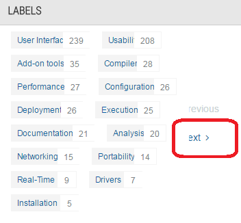
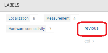
On my 1366x768 laptop screen "previous" and "next" buttons appears truncated in the labels area. Their function is really a "more labels" / "less labels" switch.
Proud to use LW/CVI from 3.1 on.
My contributions to the Developer Community
________________________________________
If I have helped you, why not giving me a kudos?
07-25-2016 10:56 AM
- Mark as New
- Bookmark
- Subscribe
- Mute
- Subscribe to RSS Feed
- Permalink
- Report to a Moderator
Minor bugs
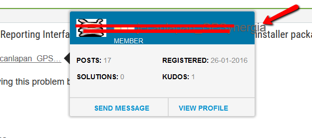
Name appears to be little bit dusky
And what about big names running out of hover window
07-25-2016 11:00 AM
- Mark as New
- Bookmark
- Subscribe
- Mute
- Subscribe to RSS Feed
- Permalink
- Report to a Moderator
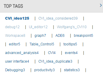
In the tag area in the Idea Exchange count for tags should be separated from the corresponding tag
Proud to use LW/CVI from 3.1 on.
My contributions to the Developer Community
________________________________________
If I have helped you, why not giving me a kudos?
07-25-2016 11:11 AM
- Mark as New
- Bookmark
- Subscribe
- Mute
- Subscribe to RSS Feed
- Permalink
- Report to a Moderator
I've gone back through the many different posts in this topic to comment where I can (or on some items I may have missed before).
I encourage you to start a new topic here if you have a particular issue to raise or to provide feedback on a certain area (such as Idea Exchange) so that it does not get lost amongst the posts here. This may make it easier for others to add their comments, as well as for the community team to provide input and updates.
Also, as you can see below there are numerous issues we're working to address. We thank you in advance for your patience!
@RobertoBozzolo wrote:
If I may add, there is no separation between floated and normal threads: I seem to remember that previous layout added some separation between those groups so it was easy to get where new content existed on normal threads.
Additionally, I personally find that solved threads are less evident than before: with the constant light background of all threads, you must see the upper right corner of each block to know if a discussion has been marked as solved (the checkmark on the left is even less evident!).
Previously, the floated (sticky) topics had a different color background. Now, there is a pin indicating if a topic is floated.
We can consider if there is another way to indicate floated topics if this is difficult to differentiate. As well as with the solved posts.
@tst wrote:
One more data point - this is the board on another computer (Win 7, also running a current version of FF) :
The top thread has unread comments, so it's bold, but it's very hard to tell the difference and be sure that it's bold. I didn't see this problem in the other PC, but I'm not sure what the difference is between them (maybe the DPI or something else along those lines).
I'm not seeing this issue on Firefox 47.0.1. on Windows 7. What is your monitor resolution?
@GregSands wrote:
In the Idea Exchanges, I can't find how to view more than the first page of comments (if there are more than 10).
This bug was already raised earlier in the thread. We're working to address it.
@Jacobson-ni wrote:
I'm not sure if this is the case for anyone else, but it looks like the screen is just cut off when using a tablet, some of the banners don't even extend to the edge of the screen and there is quite a bit of white space.
Can you please indicate what kind of tablet you are using?
Jacobson wrote: Also, on the phone, how are you supposed to get from one board to another? I'm on the Feedback board and it seems like I have to go back to the main community page, then the visit discussion forums link and then scroll down like 4 screens to choose a board. It seems like there should be an easier way but I can't seem to find it.
The breadcrumbs are not currently functioning on mobile. We're working to address this issue.
Wolfgang wrote: How can I see which posts have unread messages, for me it seems impossible. Maybe it is a browser question (Firefox 47, Win7) but this way it is really no fun to participate in the forum if you don't know if there is some new post or not...
The unread messages appear in bold. Also see previous comments in this topic regarding adding back the ability to see the number of new messages within a topic.
Norbert_B wrote: If i provide a kudo to a post, it does not update the page. As a result, i am not necessarily sure that i provided the kudo or not.
As RavensFan mentioned, the kudo does update but it is loading slowly for some reason. We are investigating this. We will also consider how we can make the update more apparent via color or otherwise.
Rod wrote: I know it's a European thing, and most US readers are happy with the AM/PM time format, but can you request again about the 24hr format. Your post reminded me how I got the time to show as 24hr. When one could enter format instructions for the date, I entered "%d/%m/%Y %H:%M" (or something similar) for the DATE and got the time as part of the date field, (and haven't changed the date setting since) so messages appear as
Thanks for reporting this. We will investigate it further.
Wolfgang wrote: Concerning the Idea Exchange, some labels are truncated, see below
Another issue for us to investigate.
RavensFan wrote: I liked that in the old layout, there was the top level view of all the boards that showed me how many new messages there were. (Reference my thread Odd numbers for new message count). With the new layout I have no way of seeing by the count which threads got new activity.
I commented on this before, but I also wanted to mention that you can still go to a category page to see the count of new posts.
GerdW wrote: The "top kudoed participients" always show the overall kudos count, regardless of the chosen time frame. Quite irritating…
We are aware of this issue and working to resolve it.
@RobertoBozzolo wrote:
On my 1366x768 laptop screen "previous" and "next" buttons appears truncated in the labels area. Their function is really a "more labels" / "less labels" switch.
Another issue we're aware of and working on.
@LVKrAkEn wrote:
Minor bugs
Name appears to be little bit dusky
And what about big names running out of hover window
Thanks. We'll work to resolve it.
07-25-2016 12:18 PM
- Mark as New
- Bookmark
- Subscribe
- Mute
- Subscribe to RSS Feed
- Permalink
- Report to a Moderator
Several of these replies reminded me of this.
Unofficial Forum Rules and Guidelines
Get going with G! - LabVIEW Wiki.
17 Part Blog on Automotive CAN bus. - Hooovahh - LabVIEW Overlord

