- Subscribe to RSS Feed
- Mark Topic as New
- Mark Topic as Read
- Float this Topic for Current User
- Bookmark
- Subscribe
- Mute
- Printer Friendly Page
Are these symbols intuitive?
04-16-2020 09:11 AM
- Mark as New
- Bookmark
- Subscribe
- Mute
- Subscribe to RSS Feed
- Permalink
- Report to a Moderator
@billko wrote:
I still have an issue with the skip step. In my mind, it's a tie between "skip" and "step over" - but I have absolutely no idea how to remedy that. Every symbol I can think of that fits one will fit the other as well. (Except, of course, text that says "skip".)
Off-topic:
Click on the picture to open it in the forum viewer. What the heck is THAT??? Too small for me to read, but is that Korean? And no matter what it is, why doesn't it match what is embedded in the post???
I know what it is - it's a low-res picture and the text is so badly rendered when on a dark background that it takes quite some squinting to realize they are, in fact, letters.
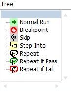
In my usage, "Normal Run" steps over. Keep in mind that these are modes, not SST buttons.
04-16-2020 11:20 AM - edited 04-16-2020 11:21 AM
- Mark as New
- Bookmark
- Subscribe
- Mute
- Subscribe to RSS Feed
- Permalink
- Report to a Moderator
I think they are too small to be useful. I am also not sure what's wrong with your image, because it looks weird when clicking on it. (strange colormap? transparency?)
04-16-2020 11:35 AM
- Mark as New
- Bookmark
- Subscribe
- Mute
- Subscribe to RSS Feed
- Permalink
- Report to a Moderator
@altenbach wrote:
I think they are too small to be useful.
In my opinion, while small, the symbols are still pretty useful because they are all visually distinct. Even if I couldn't remember a lot of the specific details of the symbols I think I would be able to quickly recognize every symbol after a few minutes using this program.
04-16-2020 11:40 AM
- Mark as New
- Bookmark
- Subscribe
- Mute
- Subscribe to RSS Feed
- Permalink
- Report to a Moderator
I don't think you could ever make an interface without documentation, but all this would need is a little cheat sheet that most people will reference just a few times before they get the hang of it.
(Mid-Level minion.)
My support system ensures that I don't look totally incompetent.
Proud to say that I've progressed beyond knowing just enough to be dangerous. I now know enough to know that I have no clue about anything at all.
Humble author of the CLAD Nugget.
04-16-2020 12:15 PM
- Mark as New
- Bookmark
- Subscribe
- Mute
- Subscribe to RSS Feed
- Permalink
- Report to a Moderator
I would love to have larger symbols, but MCLB symbols are limited to 16 x 16.
As for the image, I copied the control from a FP, then pasted it to an editor and saved it as a .PNG
Here it is as a JPG:

04-16-2020 01:01 PM - edited 04-16-2020 01:03 PM
- Mark as New
- Bookmark
- Subscribe
- Mute
- Subscribe to RSS Feed
- Permalink
- Report to a Moderator
I agree with Jacobson. They are useful. I like it when developers take the time to make interfaces intuitive and helpful!
I often tell my operators that if it hard or doesn't make sense, then I did something wrong.
And that is why I went on a rant over the LabVIEW Icons.
Former Certified LabVIEW Developer (CLD)
04-16-2020 01:30 PM - edited 04-16-2020 01:35 PM
- Mark as New
- Bookmark
- Subscribe
- Mute
- Subscribe to RSS Feed
- Permalink
- Report to a Moderator
@Jacobson-ni wrote:
@altenbach wrote:
I think they are too small to be useful.
In my opinion, while small, the symbols are still pretty useful because they are all visually distinct.
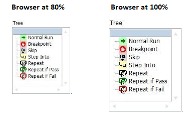
Looking at them on a bigger screens helps. Originally I was using a small hight resolution laptop. 😉
Also, my browser was set to 80% zoom, which I tend to forget. 😉
Yes, it's important to keep such small icons very simple. One of the problem is the use of color, which is of course great to make them distinguishable, but OTOH, posed problems for users that are colorblind.
04-17-2020 02:48 PM
- Mark as New
- Bookmark
- Subscribe
- Mute
- Subscribe to RSS Feed
- Permalink
- Report to a Moderator
Now I need a small button. I want to keep it small because it goes in a cluster that's inside an array.
Is this too small:
Can anybody figure out what that's supposed to do?
04-17-2020 03:50 PM - edited 04-17-2020 03:51 PM
- Mark as New
- Bookmark
- Subscribe
- Mute
- Subscribe to RSS Feed
- Permalink
- Report to a Moderator
@paul_cardinale wrote:
Now I need a small button. I want to keep it small because it goes in a cluster that's inside an array.
Is this too small:
Can anybody figure out what that's supposed to do?
SpoilerIt's for opening a block diagram
I think it is too small.
I don't know how much you could improve it though. Make sure you have some sort of tool tip with it. The key thing is that even if it isn't truly legible, as long as it is distinguishable enough from other buttons, that once people learn what the button does they will be able to associate it with its action and click on it.
But I think there is so much grey on that one, I'm not sure how distinguishable it is.
Maybe a simple box with the letters BD in it. I wouldn't be graphically pretty, but It should be easy to associate with its function.
04-17-2020 03:53 PM
- Mark as New
- Bookmark
- Subscribe
- Mute
- Subscribe to RSS Feed
- Permalink
- Report to a Moderator
@RavensFan wrote:
Maybe a simple box with the letters BD in it. I wouldn't be graphically pretty, but It should be easy to associate with its function.
I was thinking maybe a small "Add" primitive (just a teeny yellow triangle with a plus sign). It's pretty recognizeable. I'd also give it a white background (like the block diagram) rather than a gray one (like the front panel).


