- Subscribe to RSS Feed
- Mark Topic as New
- Mark Topic as Read
- Float this Topic for Current User
- Bookmark
- Subscribe
- Mute
- Printer Friendly Page
Block Diagram Items get spread out.
Solved!04-15-2024 07:05 PM
- Mark as New
- Bookmark
- Subscribe
- Mute
- Subscribe to RSS Feed
- Permalink
- Report to a Moderator
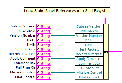
When aligning things on the block diagram (references, controls, indicators, local variables) - I usually organize them so that all my wires run directly into the bundle by name cluster.
Similar to this example
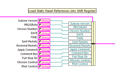
But lately when I open the block diagram, I notice everything has been shifted (see example below). I imagine this is to prevent slight overlaps of the references, controls ...
This appears to be a recent thing. I am not fond of the look and am wondering if it is a Block Diagram Option that I can turn off. Currently using LabVIEW 2018, SP1. I am not sure when this is happening or why. If I realign things to look like the above example, then close the Panel and re-open it, I don't see any changes. Even if I close LabVIEW completely. So I am thinking it has done this once to all my panels (100's of panels and 1000's of vi's). If it is an option that I turned on at some point or another developer has turned on, I would like to know what option so I can turn it off. Or at least prevent it from happening again.
Has anyone else seen this type of behavior. It is basically a "vertical compress" applied to the references, controls, indicators, then shifting up to center them around the bundle.
Other Details:
Windows 10.
LabVIEW 2018 SP1.
Solved! Go to Solution.
04-15-2024 07:14 PM
- Mark as New
- Bookmark
- Subscribe
- Mute
- Subscribe to RSS Feed
- Permalink
- Report to a Moderator
This points to a systems font getting updated/changed. In some recent version (2023?), there was an effort to try to standardize the size of the Bundle By Name along with others.
There are only two ways to tell somebody thanks: Kudos and Marked Solutions
Unofficial Forum Rules and Guidelines
"Not that we are sufficient in ourselves to claim anything as coming from us, but our sufficiency is from God" - 2 Corinthians 3:5
04-15-2024 07:38 PM
- Mark as New
- Bookmark
- Subscribe
- Mute
- Subscribe to RSS Feed
- Permalink
- Report to a Moderator
Thank you.
I believe I may have done it to myself then. I have played around with fonts to try and standardize a size and type - probably some time in the last 6 to 8 months. Then had a couple of months of mostly documentation work. And now - last 3 - 4 months as I jump back into implementation I am starting to see all the damage.
I will leave it as is for now. Hoping to transition to LabVIEW 2023 at some point. After that I will do some manual clean ups to panels that require changes.
Thanks again
Relec


