- Subscribe to RSS Feed
- Mark Topic as New
- Mark Topic as Read
- Float this Topic for Current User
- Bookmark
- Subscribe
- Mute
- Printer Friendly Page
Directional arrows in XY graph
01-21-2018 12:55 PM
- Mark as New
- Bookmark
- Subscribe
- Mute
- Subscribe to RSS Feed
- Permalink
- Report to a Moderator
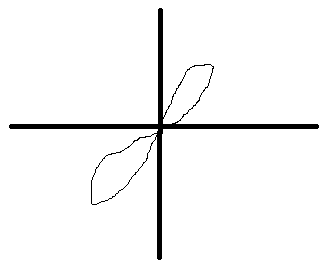
I use an XY graph to plot test data which is synchronized and resampled to align. The resulting plots usually look something like this:
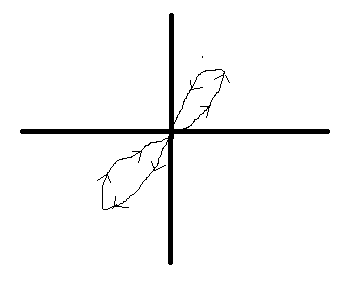
What I would like to do is add little directional arrows indicating the time order of plotting. This is useful for analysis since the plots represent hysteresis in my test system. The order in which the system is exercised determines some aspects of the hysteresis effect. So I usually have to plot out the time based plots of each of the XY graph inputs. If I could add directionality onto the above plot, I could avoid needing to do that. So, is there any way to do this with the built in LV XY plot to make it look something like this?

I was contemplating using annotation arrows, but haven't yet experimented to see if that was possible.
Thanks,
XL600
01-21-2018 02:38 PM
- Mark as New
- Bookmark
- Subscribe
- Mute
- Subscribe to RSS Feed
- Permalink
- Report to a Moderator
Easiest would be to just make a second plot with data consisting of 3 point separated by a NaN (each three points are the "end-tip-end" positions of each arrow). Another option would be to use image function and the "plot images" tool.
01-21-2018 03:12 PM
- Mark as New
- Bookmark
- Subscribe
- Mute
- Subscribe to RSS Feed
- Permalink
- Report to a Moderator
Hmm, I’d have to come up with a way to determine the rough vector so the ends would be symmetric about the data. Determining the point is easy enough... just place 20 or so along the data length, evenly spaced.
01-21-2018 03:49 PM
- Mark as New
- Bookmark
- Subscribe
- Mute
- Subscribe to RSS Feed
- Permalink
- Report to a Moderator
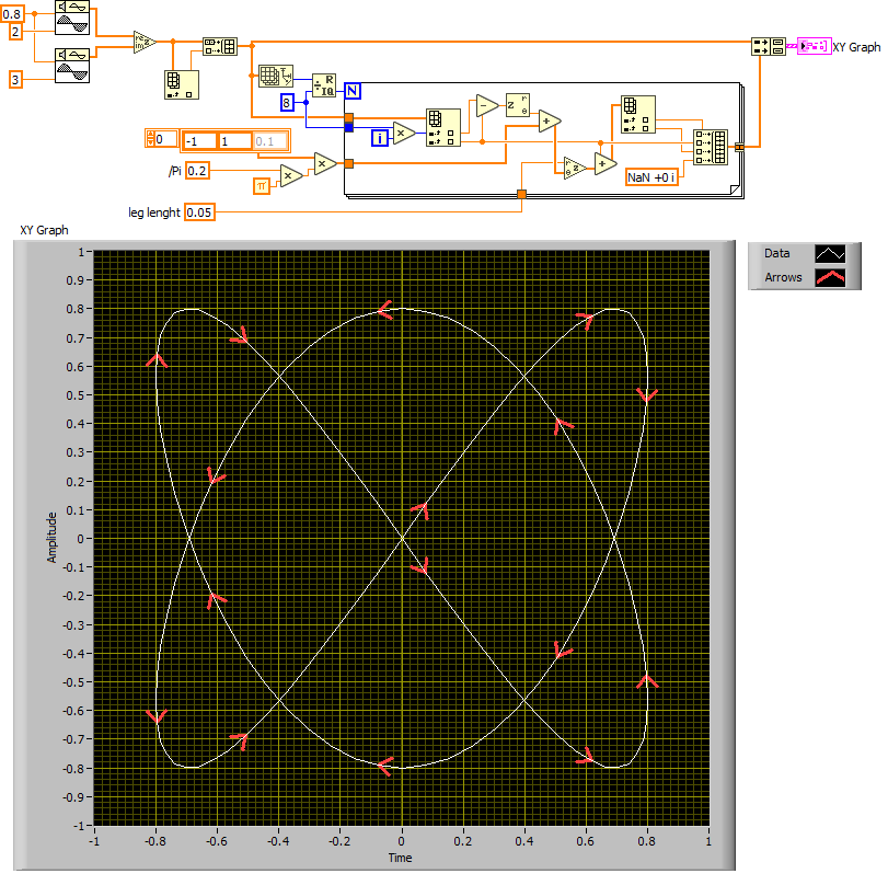
Well, if you do the xy graph using complex, you can get the local direction from any two adjacent points. Here's a quick draft. Very rough, I'm sure it needs a few tweaks.
- Tags:
- xygraph vectors
01-21-2018 04:05 PM
- Mark as New
- Bookmark
- Subscribe
- Mute
- Subscribe to RSS Feed
- Permalink
- Report to a Moderator
That is simply awesome ![]()
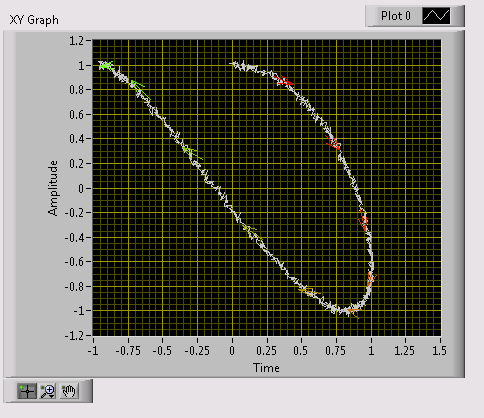
The data I’m using is a bit noisy (X and Y are coming from analog sensors) so adjacent points wouldn’t work. I’ll have to take small segments and generate a line fit. But the idea looks like it’ll work great. I can’t wait to get into work to try it (don’t have LV at home ![]() ).
).
thanks for the idea!
01-22-2018 05:23 PM
- Mark as New
- Bookmark
- Subscribe
- Mute
- Subscribe to RSS Feed
- Permalink
- Report to a Moderator
Here's an approach using annotations. I thought this might work, but LV doesn't provide very much in the way of programmatic control over the annotation (EX: Line width). I had to use events to redraw the arrows due to the way the label position offsets are handles when zooming.
Honestly, the overlay plot with NaN seems like it would work better because of the limitations of programmatic annotation control.
10-12-2023 07:06 AM
- Mark as New
- Bookmark
- Subscribe
- Mute
- Subscribe to RSS Feed
- Permalink
- Report to a Moderator
Thumb Up 👍. I did not know xy-Graph can use complex data.


