- Subscribe to RSS Feed
- Mark Topic as New
- Mark Topic as Read
- Float this Topic for Current User
- Bookmark
- Subscribe
- Mute
- Printer Friendly Page
Graph/Chart scale options
Solved!11-19-2019 03:09 PM
- Mark as New
- Bookmark
- Subscribe
- Mute
- Subscribe to RSS Feed
- Permalink
- Report to a Moderator
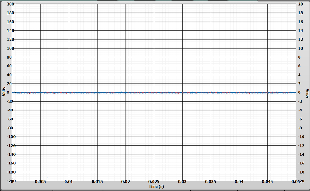
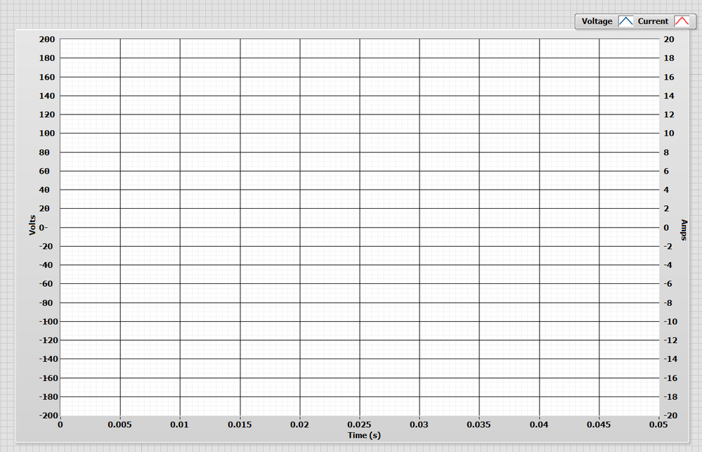
Okay now how do I make the scale on the left Y-axis (Volts) and the X-Axis (Time) look like the right Y-Axis (Amps) scale?
That is so the numbers do not overlap the chart area or each other at the corners?
I really don't know how I managed to get the right side looking perfect but I have tried resizing everything like the chart area but it just resizes the whole thing and I can't get the other two sides to look even close to the Amps scale.

=== Engineer Ambiguously ===
========================
Solved! Go to Solution.
11-19-2019 03:22 PM
- Mark as New
- Bookmark
- Subscribe
- Mute
- Subscribe to RSS Feed
- Permalink
- Report to a Moderator
I attached a VI with the chart in question
=== Engineer Ambiguously ===
========================
11-19-2019 03:24 PM
- Mark as New
- Bookmark
- Subscribe
- Mute
- Subscribe to RSS Feed
- Permalink
- Report to a Moderator
Did you customize the control? If I remake that control with a regular chart, it autosizes and the numbers look fine. I can't even figure out a way to move the axis label location around unless I do Customize Control.
Other than using Customize Control, the YScale.Position property will move the tickmarks around. (Be sure to set Active Y Scale to the correct axis first).
Can you either post your chart, or just delete it and remake it from scratch? It looks like a Custom Control that got bonked a little.
11-19-2019 03:35 PM
- Mark as New
- Bookmark
- Subscribe
- Mute
- Subscribe to RSS Feed
- Permalink
- Report to a Moderator
Ah, I see you posted your code. Play around with YScale.Position and YScale.Marker.Left. Personally I'd just recreate this from a basic Silver chart, that'll get the auto-snapping to work again, but this seemed to fix it.
Set YScale.Marker.Justify to Right, then use YScale.Marker.Position.Left to scoot it over to the side a bit.
You can do similar with the X scale to get it lower.
11-19-2019 03:37 PM - edited 11-19-2019 03:40 PM
- Mark as New
- Bookmark
- Subscribe
- Mute
- Subscribe to RSS Feed
- Permalink
- Report to a Moderator
Actually I swapped sides then swapped them back and it seemed to fix the overlapping issue and resized the border...
I am not sure how I messed up the chart area in the first place, I did not make any custom modifications to it.
But this has been a "cosmetic bug" in my program for quite some time.
=== Engineer Ambiguously ===
========================

