- Subscribe to RSS Feed
- Mark Topic as New
- Mark Topic as Read
- Float this Topic for Current User
- Bookmark
- Subscribe
- Mute
- Printer Friendly Page
Histogram Help
Solved!04-24-2018 06:32 PM
- Mark as New
- Bookmark
- Subscribe
- Mute
- Subscribe to RSS Feed
- Permalink
- Report to a Moderator
Hi,
I need help creating a histogram of some data.
I want to create a histogram where:
x-axis=Letter Grade (A, B, C, D, F)
y-axis= number of students got each of the letter grade.
This is part of a project i am working on at the moment. Please look at the attached file and help me at your earliest convenience.
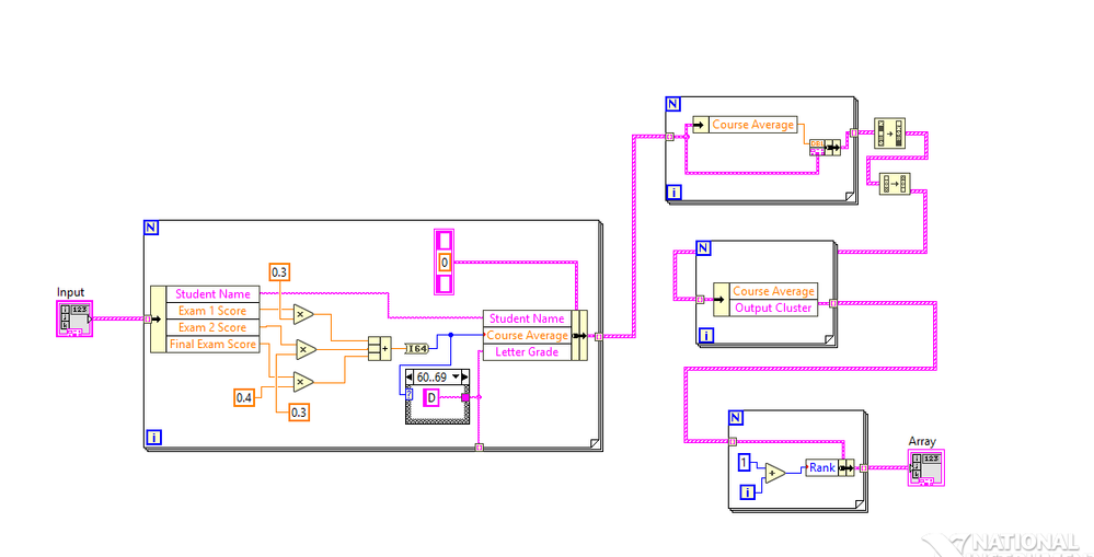
In this project, i needed to calculate the course average, assign each student a grade, and rank them based on their course average. At last i need to create a histogram of distribution. I tried Histogram sub-VI, and histogram from the probability menu. Couldn't get it to work. Any help would be greatly appreciated.
Solved! Go to Solution.
04-24-2018 07:12 PM - edited 04-24-2018 07:14 PM
- Mark as New
- Bookmark
- Subscribe
- Mute
- Subscribe to RSS Feed
- Permalink
- Report to a Moderator
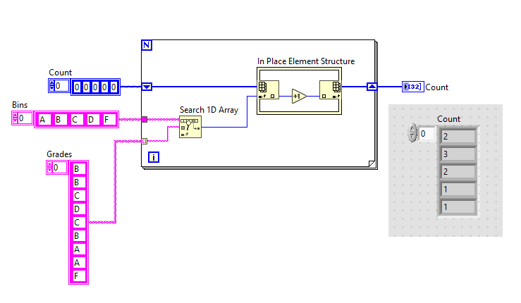
Unfortunately you cannot use text as the x-axis scale. You can either use 0 1 2 3 4 and know that it means A B C D F, or hide the tick mark labels completely and just put text boxes where they need to go.
You have your bins defined already, all you need to do is count how many are in each bin. Here is one way to do that using the in place element structure:
04-24-2018 07:36 PM
- Mark as New
- Bookmark
- Subscribe
- Mute
- Subscribe to RSS Feed
- Permalink
- Report to a Moderator
Thank you for your reply. This is my first labview course and i have never used the in place structure. Also, it is a little difficult for me to implement on my program. Is there any other simple way i can do this? Like using the Histogram Subvi or something else? Thanks again.
04-24-2018 07:38 PM
- Mark as New
- Bookmark
- Subscribe
- Mute
- Subscribe to RSS Feed
- Permalink
- Report to a Moderator
Also, if you can please do problem similar to mine. If not, i totally understand.
04-24-2018 10:00 PM - edited 04-24-2018 10:06 PM
- Mark as New
- Bookmark
- Subscribe
- Mute
- Subscribe to RSS Feed
- Permalink
- Report to a Moderator
I think gregory's solution is probably what you want.
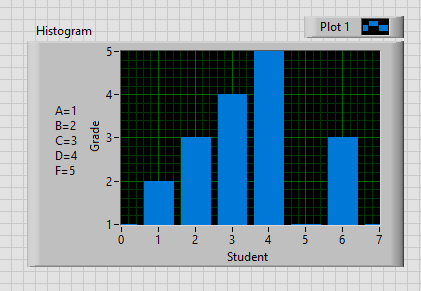
Here's an example that might be a little clearer:
To set the graph with that appearance, I clicked the icon at the top right and chose the plot style from the Bar Plot subsection (perhaps you already knew this - it was something I just learned 🙂 )
Here I'm basically just plotting a bundle of an array of X and an array of Y values, where X = {0, 10, 20, ...} and Y is the number in that decade.
If you want to have non-even interval sizes, you should look at Threshold 1D Array, but this would take quite a bit more work handling fractional behaviour and making the graph look nice...
04-25-2018 09:26 AM
- Mark as New
- Bookmark
- Subscribe
- Mute
- Subscribe to RSS Feed
- Permalink
- Report to a Moderator
Which array function are you guys using inside the in place element structure? @greogoryj @cbutcher. Index array?
04-25-2018 10:24 AM
- Mark as New
- Bookmark
- Subscribe
- Mute
- Subscribe to RSS Feed
- Permalink
- Report to a Moderator
Thank you. I was able to figure it out. Really appreciate the help 🙂
04-25-2018 01:17 PM - edited 04-25-2018 02:04 PM
- Mark as New
- Bookmark
- Subscribe
- Mute
- Subscribe to RSS Feed
- Permalink
- Report to a Moderator
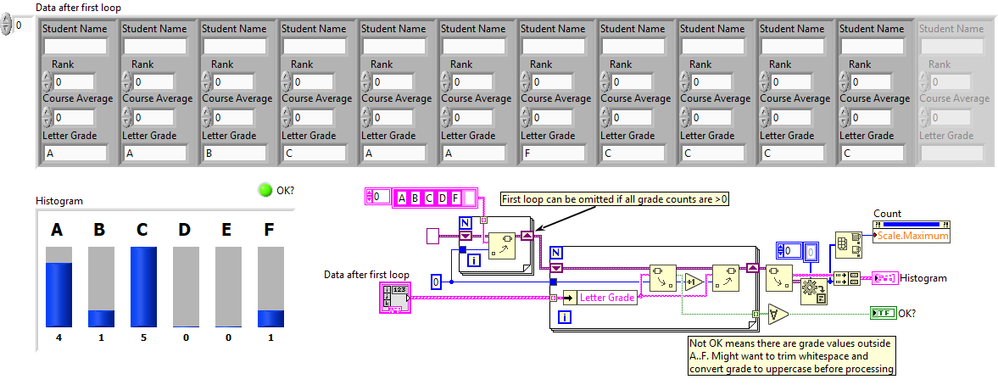
As an alternative, you could use variant attributes for the counting and use an array of clusters (grade, count) as indicator. Here's a quick draft. It will even tell you if there are unexpected letter grades (e.g. lower case grade, grade with a space or linefeed afterwards, etc.). The input is the array after your first loop.
(Also note that in your original code, you could combine the last two FOR loops into one for simplicity. Also the first two loops can be combined. You could even include the code of my second loop into your first loop)
04-25-2018 01:58 PM - edited 04-25-2018 02:06 PM
- Mark as New
- Bookmark
- Subscribe
- Mute
- Subscribe to RSS Feed
- Permalink
- Report to a Moderator
Note: Of course there is no "D" grade, so change code accordingly. Sorry about that. I fixed and re-attached 😄
@altenbach wrote:
(Also note that in your original code, you could combine the last two FOR loops into one for simplicity. Also the first two loops can be combined. You could even include the code of my second loop into your first loop)
Here's how this could look like.
04-25-2018 07:20 PM
- Mark as New
- Bookmark
- Subscribe
- Mute
- Subscribe to RSS Feed
- Permalink
- Report to a Moderator
Thank you sir. I really appreciate the help 🙂
I learned a lot from this forum, specially from you @altenbach 🙂


