- Subscribe to RSS Feed
- Mark Topic as New
- Mark Topic as Read
- Float this Topic for Current User
- Bookmark
- Subscribe
- Mute
- Printer Friendly Page
How to get a smooth plot?
09-20-2017 05:02 AM
- Mark as New
- Bookmark
- Subscribe
- Mute
- Subscribe to RSS Feed
- Permalink
- Report to a Moderator
Hello Everyone,
I have a set of X and Y axis values and I need to plot them as a smooth curve (like: Attachment- Smooth.png) but I get a rough plot with sharp edges (Attachment - Output.png). Could you help me to get the smooth plot?
Thanks for your idea..
- Tags:
- graph
09-20-2017 05:19 AM
- Mark as New
- Bookmark
- Subscribe
- Mute
- Subscribe to RSS Feed
- Permalink
- Report to a Moderator
Hi,
To have a curve, You will use a method of intepolation.
find it in the palette : Mathematic->Interpolation & Extrapolation.
Best regards,
Fred
Kudos are welcome![]()
09-20-2017 06:21 AM
- Mark as New
- Bookmark
- Subscribe
- Mute
- Subscribe to RSS Feed
- Permalink
- Report to a Moderator
Hello Fred!
Thanks for your reply.
I have already tried with "Spline" functions but found nothing as required. If possible, could you please suggest your idea with an example?
Thanks,
Karthiga.
09-20-2017 06:37 AM
- Mark as New
- Bookmark
- Subscribe
- Mute
- Subscribe to RSS Feed
- Permalink
- Report to a Moderator
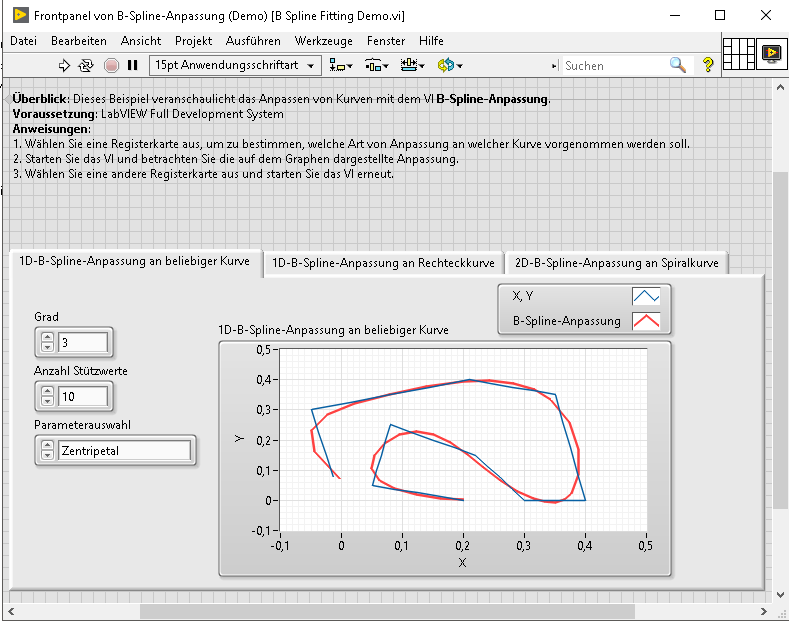
have a look at the examples
"..\National Instruments\LabVIEW 2017\examples\Mathematics\Fitting\B Spline Fitting Demo.vi"
09-21-2017 06:33 AM
- Mark as New
- Bookmark
- Subscribe
- Mute
- Subscribe to RSS Feed
- Permalink
- Report to a Moderator
Hi alexderjuengere,
I am here to say that the method which has been followed in the example code you suggested, did not work for me. Anyway, thank you for your information!
Regards,
Karthiga
09-21-2017 07:46 AM
- Mark as New
- Bookmark
- Subscribe
- Mute
- Subscribe to RSS Feed
- Permalink
- Report to a Moderator
Deciding how to plot data requires thinking about the data and what it might represent. Your illustration showed only three points. If those are all the data that you have, and if there is not some assumed underlying "rule" that suggests a relationship between the points, then you may be best in plotting the data just as isolated points (emphasizing you are making no assumptions about what would be expected for other samples at "in-between" points), or possible a bar graph.
On the other hand, if you think there is a "rule" (such as Y should be a linear function of X, or Y should be a low-order polynomial of X, or Y represents a periodic function of X, or Y is related logarithmically, or exponentially, or via a power law, to X), then you can indulge in some curve-fitting, and once you have a fitting function, you plot the function (which will probably not pass through the points). Note that connecting the points with straight lines is equivalent to saying "I don't know anything about what happens between the points, but I'm confident that at these values of X, Y is the "correct" number, so I'll assume that Y varies linearly as a function of X when I'm between two X values".
In other words, in the absence of a "model", or some idea how the Y values should look at points where you have no measured data, and in the absence of "uncertainty" measures for the X and Y values you are using, isolated points probably represent your data in the "least-misleading" (what a concept!) way, and "connect the dots" is common enough that most readers will intuitively understand that you are "presenting data without a model".
Bob Schor
09-21-2017 10:55 AM
- Mark as New
- Bookmark
- Subscribe
- Mute
- Subscribe to RSS Feed
- Permalink
- Report to a Moderator
@Karthiga wrote:
Hi alexderjuengere,
I am here to say that the method which has been followed in the example code you suggested, did not work for me. Anyway, thank you for your information!
Regards,
Karthiga
How about you attach the data-points you want to smooth as a .csv ?
09-21-2017 11:55 AM - edited 09-21-2017 11:59 AM
- Mark as New
- Bookmark
- Subscribe
- Mute
- Subscribe to RSS Feed
- Permalink
- Report to a Moderator
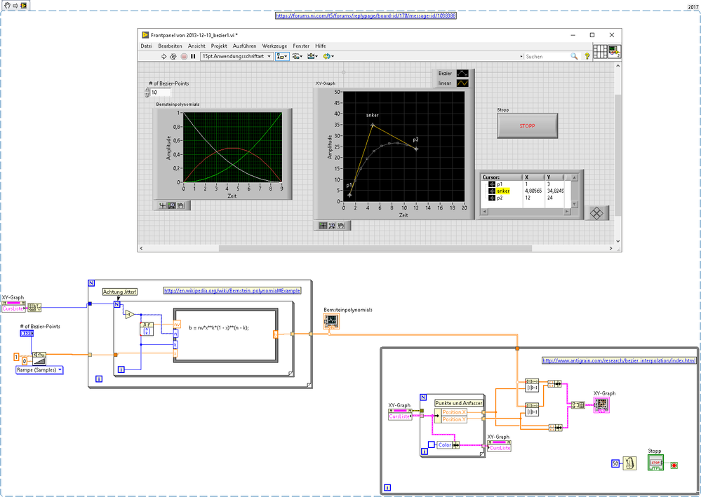
wait a second, I once wrote this demo of a Bezier Interpolation between two Data Points (P1,P2) and a third anchor point (Anker),
because the built-in LabView .vi is designed for a different use of Bezier-Interpolation and I wasn't able to modify the built-in to my needs


