- Subscribe to RSS Feed
- Mark Topic as New
- Mark Topic as Read
- Float this Topic for Current User
- Bookmark
- Subscribe
- Mute
- Printer Friendly Page
Placing the trigger 'dot' on a time waveform
Solved!08-23-2018 04:55 PM
- Mark as New
- Bookmark
- Subscribe
- Mute
- Subscribe to RSS Feed
- Permalink
- Report to a Moderator
The plot is a Waveform Chart, so both the Data and the "dots" need to be Waveform. I was hoping you'd experiment a bit and figure it out, but I guess you couldn't be bothered.
Here's what you do:
- Start with a Waveform of your own that you want to plot, and want to show "dots" on the peaks. Let's call this Waveform "Data". Note that Data has to be a Float, it can't be an Integer!
- Make a copy of Data, call it "Dots". Go into the Y component (the Values) and make them all "NaN" (Not a Number, a Float value that won't plot).
- Do whatever computation you need to find the peaks in Data. Save the X, Y pairs (X is the index into the Y array, Y is the value at the peak) in array "Peaks".
- Using "Peaks", set the corresponding element in Dots (whose index is given by Peaks.X) to Peaks.Y.
- Plot Data and Dots together on a Plot. Set the Plot Style of Dots to "Dots", set the Interpolation to "Points Only". Set the color so you can see it, and consider making the size a little bigger.
For those who are just curious, Secret Sauce took the Waveform that was 0.1 "almost everywhere" except that it was 1.1 at the peaks and replaced every value <0.5 with NaN to make the Pulse Baseline unplotted.
Bob Schor
08-23-2018 05:19 PM
- Mark as New
- Bookmark
- Subscribe
- Mute
- Subscribe to RSS Feed
- Permalink
- Report to a Moderator
Bob,
I did experiment. My problem is not having sufficient experience with arrays, clusters, bundles, etc. I am trying to finish this project for my shops before I turn 70. That's next year!
08-23-2018 09:34 PM
- Mark as New
- Bookmark
- Subscribe
- Mute
- Subscribe to RSS Feed
- Permalink
- Report to a Moderator
Was my explanation of the steps to take clear enough? If not, attach the VI that you are using to (a) plot an array of data and (b) create a list of (I should call them Time and Y) points that you want to "dot" (because they are the peaks) and I'll add the code that implements what I described. It would be useful if you attached a data file and a "Peaks" file (the set of Time/Y pairs that you want to "mark") so I can do my own test of my code and be sure I didn't make a stupid mistake (I'm not that young, myself ...).
Bob Schor
08-24-2018 04:22 AM
- Mark as New
- Bookmark
- Subscribe
- Mute
- Subscribe to RSS Feed
- Permalink
- Report to a Moderator
Bob,
Here is a vi that explains what I am trying to do. I have used the peak detector vi to find the trigger 'pulses' and put them in an array. The 'locations' are an index number of the bin where the peak is, so I needed to multiple the location by delta t to get the correct time location. Now all I need to do is represent those trigger 'pulses' as small red dots on the sine wave. Also notice the magnitudes are not the same and the time is also shifted. Both waveforms are the same frequency. Thanks in advance.
08-24-2018 09:44 AM
- Mark as New
- Bookmark
- Subscribe
- Mute
- Subscribe to RSS Feed
- Permalink
- Report to a Moderator
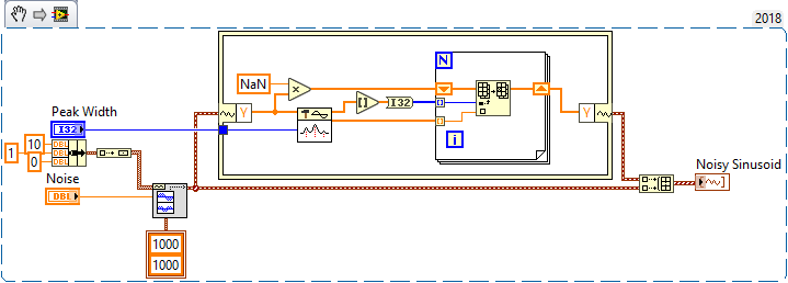
OK, there were no data (so I had nothing with which to work), so I made a "Teaching Example". First of all, when Dynamic Data Wires were first introduced, I tried them for about two days, then said "Who thought this was a Good Idea?", and have never gone back. So this example uses Waveforms directly.
My "sample signal" is a Noisy Sine Wave, generated by the Multi-Tones with Noise VI. I generated an Amplitude 1, 10 Hz sinusoid for a second at a sampling rate of 1KHz, and used a default (changable) value for RMS noise of 0.1 for a S/N of 10. The Snippet showed what I did to make the Dot Plot, but I'll describe it, anyway.
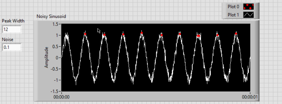
I start by making an "invisible" copy of the input Data (Y) by multiplying the Y array by NaN, "Not a Number", which won't plot. I then take the original Y array and use the Peak Finder. If you use the default Peak Width of 3, you'll find lots of peaks near the top of the Sinusoid -- I found that a width of 12 got mostly a single "peak" and got most of them. [This should be a lesson -- Test What You Plan To Do to see if it Works As You Expect].
The Peak Detector does not return indices -- it interpolates, so round and make an I32. Now we need to set the Peak values of the Dot array, which we do in the For loop. We then bring out the Dots plot and combine it with the original Test Data and plot everything.
There are several important considerations in organizing the plot. First, the first Plot is on top of all the others, so I suggest making this the Dots plot. Second, make the Plot Style of the Dots plot a large Dot, and turn off interpolation (you don't want lines).
Note that because I'm plotting Waveforms, the X axis is explicitly Time. I find this a nuisance most of the time -- you can get rid of it by plotting only the Y arrays (you'll have a 2D array of data), then your X will say "Time" but will be initially "Index".
Bob Schor
08-24-2018 02:49 PM
- Mark as New
- Bookmark
- Subscribe
- Mute
- Subscribe to RSS Feed
- Permalink
- Report to a Moderator
Bob,
FINALLY figured out how to get those waveform attributes on the sides of the in place element structure! No go on the plot, but I am getting closer. I don't think you fully understood what I need. I have an existing sine wave AND an addit ional square wave that due to a 5% duty cycle looks like a TTY trigger pulse. I put the code into a vi as close as I could get to what you drew, but as you can see, the screen is close but no cigar. First, there a ton of red dots, but the good news is that the ones that are plotting high above the sine wave look like they are in the correct time position, the position of the trigger. I just need to get the amplitude of the dots down on the curve and eliminate the dots that are way down in the mud.
Ron
08-24-2018 09:13 PM
- Mark as New
- Bookmark
- Subscribe
- Mute
- Subscribe to RSS Feed
- Permalink
- Report to a Moderator
Are you trying to find the peak of the narrow pulse? Why? Just use the pulse itself! [There's clearly something subtle here I'm missing]. Also notice that you are scheduling three plots, but showing only two on the Graph/Chart.
But you are clearly close -- I'm sure the remaining pieces will fall into place ...
Bob Schor
08-25-2018 04:41 AM
- Mark as New
- Bookmark
- Subscribe
- Mute
- Subscribe to RSS Feed
- Permalink
- Report to a Moderator
Bob,
I realized right after I send the last reply, I could explain this more clearly. The trigger 'point' is happening at a time, X. This time does not necessarily coincide with either the max or the min in the sine wave. It could be at any time, but both the trigger and the sine wave are of the same frequency.
So, would it be easier to look at it this way:
Find the dt of the trigger point, take the Y values of the sine wave and create a plot array from that. Then plot over the sine wave and turn the trigger point red.
Ron
08-25-2018 05:34 AM
- Mark as New
- Bookmark
- Subscribe
- Mute
- Subscribe to RSS Feed
- Permalink
- Report to a Moderator
Sometimes it just takes a new day. I have what I want, now I just have to figure out why the trigger point is drifting. It should be at the same location in time on every sine wave peak. But, thanks to your kick start I finally figured out I needed to read the Y value of the sign wave and use that instead of the amplitude from the peak detector! Any reason you can see for the time difference?
Thanks for your help.....KUDOS Time!
Ron
08-25-2018 06:41 AM
- Mark as New
- Bookmark
- Subscribe
- Mute
- Subscribe to RSS Feed
- Permalink
- Report to a Moderator
Bob,
Good news you have a convert. I got rid of the Express vi's because I thought they r might be the issue. Bad news is I expanded the time view and discovered a serious problem. The trigger pulses are residing on their own low frequency sine wave and aren't lining up on the original sine wave at all!!! I know this is something minor but I am at a loss.


