- Subscribe to RSS Feed
- Mark Topic as New
- Mark Topic as Read
- Float this Topic for Current User
- Bookmark
- Subscribe
- Mute
- Printer Friendly Page
Ploting Time values
11-01-2018 02:13 PM
- Mark as New
- Bookmark
- Subscribe
- Mute
- Subscribe to RSS Feed
- Permalink
- Report to a Moderator
I have a time it takes between cycles. This is in seconds. I want to plot the time it takes between cycles to a graph. In the attached program, it will be the Seconds No Change indicator that has the value I want to plot. You click the Cycle On/Off Boolean to make the seconds reset and start counting seconds between Cycles again. I would like to plot this over time so I can see if the time between cycles is drifting with fluid temperature. This is just a simulation and has to have the cycles entered by clicking the Boolean. So the ending seconds that it took to cycle should be plotted to show history on a graph or chart. Not interested in the in between 0 and time to cycle, only want to plot the time it took to cycle so I could glance and the chart and tell if the time is changing over time.
11-01-2018 02:24 PM
- Mark as New
- Bookmark
- Subscribe
- Mute
- Subscribe to RSS Feed
- Permalink
- Report to a Moderator
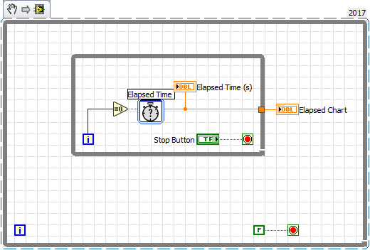
How about this?
=== Engineer Ambiguously ===
========================
11-01-2018 02:48 PM - edited 11-01-2018 02:51 PM
- Mark as New
- Bookmark
- Subscribe
- Mute
- Subscribe to RSS Feed
- Permalink
- Report to a Moderator
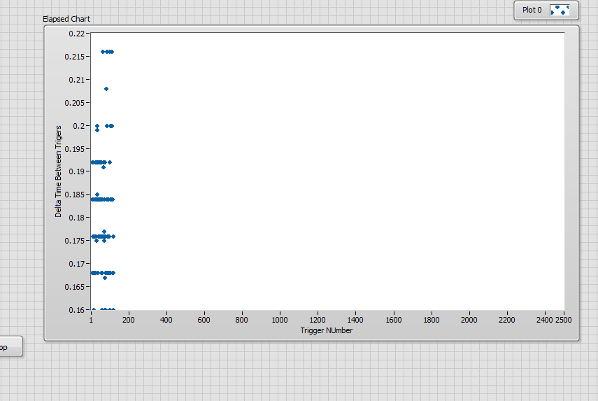
I need to clarify my needs. I will need to plot the seconds it takes to cycle (y-axis) vs the Number of cycles (x-axis). So maybe a scatter chart if LabVIEW has that maybe. The x-axis needs to be a count. So it would start at zero and every time I have a cycle add one (1) to the x-axis. The y-axis only plots the value of the seconds it took to cycle. See example of number of cycles vs time it took to cycle. This is approx. 2500 cycles plotted.
11-01-2018 04:06 PM - edited 11-01-2018 04:33 PM
- Mark as New
- Bookmark
- Subscribe
- Mute
- Subscribe to RSS Feed
- Permalink
- Report to a Moderator
Change the properties and labels on the X and Y axis then.
I just threw that together leaving out the little details like setting the graph properties and properly labeling the axis.

=== Engineer Ambiguously ===
========================

