- Subscribe to RSS Feed
- Mark Topic as New
- Mark Topic as Read
- Float this Topic for Current User
- Bookmark
- Subscribe
- Mute
- Printer Friendly Page
creating a bar graph...
Solved!04-03-2013 03:09 PM
- Mark as New
- Bookmark
- Subscribe
- Mute
- Subscribe to RSS Feed
- Permalink
- Report to a Moderator
...two questions, one presumably simple, and the other a bit tricky:
1. The graph is to show 64 points on the X axis. How do I specify the "fatness" of my bars?
2. The boss says he wants every other value colored differently: red-blue-red-blue-red-blue...is there a way to do this?
What I'm actually plotting is 32 complex numbers. He wants the real component in one color, and the imaginary in another. So, 32 points of 2 values each is my 64 points total.
Thanks for any assistance.
Solved! Go to Solution.
04-03-2013 03:23 PM
- Mark as New
- Bookmark
- Subscribe
- Mute
- Subscribe to RSS Feed
- Permalink
- Report to a Moderator
1) I think you can't. Few years ago I have submitted a feature request here. You are invited to support it by giving it a kudos
2) Not directly. You could use two plots, one in red, one in blue. Or, with more effort, addressing both issues, you could use PlotRectangle....
04-03-2013 05:20 PM
- Mark as New
- Bookmark
- Subscribe
- Mute
- Subscribe to RSS Feed
- Permalink
- Report to a Moderator
Well...that's a bit unfortunate. How does this sound:
I'm thinking of having an expanded data array, in which each of my points occupies, say, 5 elements in the array. I guess I'd have to throw in a few empties between them, too, to provide some gaps. So, if my data array were:
[100, -1234, 1911...]
the array I'd pass to PlotX would be like:
[100, 100, 100, 100, 100, 0, 0, -1234,-1234,-1234,-1234,-1234, 0, 0, 1911, 1911, 1911, 1911, 1911...]
To get the bi-color effect, I suppose I'll have to change the gap sizes, and just overlay the two plots, right?
Any thoughts on this? I don't imagine the performance hit would be too terrible (at least for my purposes).
04-04-2013 12:34 AM
- Mark as New
- Bookmark
- Subscribe
- Mute
- Subscribe to RSS Feed
- Permalink
- Report to a Moderator
Update: for whatever reason, I was totally unable to get any variations on PlotX() to work for me. Here's one form of the call that I tried:
	plotHandle = PlotX(PANEL_MAIN,
						PANEL_MAIN_TAPS_PLOT,
						plotArray,
						nbrPoints,
						VAL_INTEGER,
						//VAL_FAT_LINE,
						VAL_VERTICAL_BAR,
						//VAL_BASE_ZERO_VERTICAL_BAR,
						VAL_SOLID_SQUARE,
						VAL_SOLID,
						1,
						VAL_RED);
	rc = RefreshGraph(PANEL_MAIN, PANEL_MAIN_TAPS_PLOT);
If anyone sees anything wrong with it, I'd appreciate a heads-up. I implemented a solution with rectangles that is adequate for now, but I'd still like to get the above code fixed.
Thanks.
04-04-2013 02:00 AM
- Mark as New
- Bookmark
- Subscribe
- Mute
- Subscribe to RSS Feed
- Permalink
- Report to a Moderator
Shouldn't you call PlotY instead of PlotX?
Alternatively, if your graph is not autoscaling you may simply be missing the bars because they are out of visible range.
Proud to use LW/CVI from 3.1 on.
My contributions to the Developer Community
________________________________________
If I have helped you, why not giving me a kudos?
04-04-2013 11:12 AM
- Mark as New
- Bookmark
- Subscribe
- Mute
- Subscribe to RSS Feed
- Permalink
- Report to a Moderator
Oh, brother...I just love making stupid mistakes like that. Of course you're right, Roberto, and it works fine now. Sheesh...
I still don't like the 1-pixel wide "bars" though, and I think I'll use my rectangles instead. But thanks for furthering my CVI education a bit.
04-05-2013 02:13 AM - edited 04-05-2013 02:16 AM
- Mark as New
- Bookmark
- Subscribe
- Mute
- Subscribe to RSS Feed
- Permalink
- Report to a Moderator
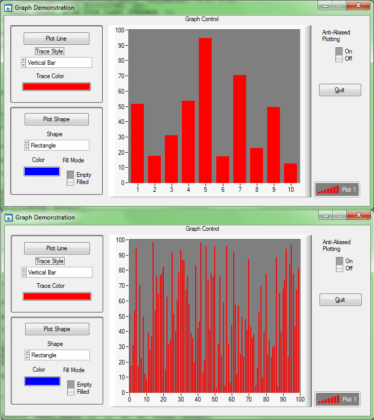
With reference to the bar thickness, it appears that the graph is a "smart control" ![]() : it adapts bar width to actual data plotted.
: it adapts bar width to actual data plotted.
Specifically, it appears that thickness is related to number-of-bars / axis-width ratio.
See this picture: the same CVI example with 100 and 10 data points plotted.
(Note: with thick bars you may have to struggle a bit to have the correct X scale shown. In the 10-samples example above, I enabled label strings for the graph X axis, used a scale of -0.5 to 9.5 and created the appropriate labels for integer values)
Proud to use LW/CVI from 3.1 on.
My contributions to the Developer Community
________________________________________
If I have helped you, why not giving me a kudos?
- Tags:
- Graph_vertical_bars
04-05-2013 07:28 PM
- Mark as New
- Bookmark
- Subscribe
- Mute
- Subscribe to RSS Feed
- Permalink
- Report to a Moderator
Thanks, Roberto. I guess the "smartness" in the control is something of a mixed blessing. I allowed enough space for the bars to be considerably wider than they were representing, so it appears that there has to be some threshold (which I didn't get to) of width in the plot area before CVI re-sizes the bars for you.
No matter, really, as the rectangles seem to be fine.
04-07-2013 03:51 PM
- Mark as New
- Bookmark
- Subscribe
- Mute
- Subscribe to RSS Feed
- Permalink
- Report to a Moderator
Can you attach a picture of your graph with vertical bars inside so that we can look at how they appear?
Proud to use LW/CVI from 3.1 on.
My contributions to the Developer Community
________________________________________
If I have helped you, why not giving me a kudos?
04-09-2013 12:25 PM
- Mark as New
- Bookmark
- Subscribe
- Mute
- Subscribe to RSS Feed
- Permalink
- Report to a Moderator
Sorry it took me so long to reply -- I've been stuck in TCP purgatory the last couple of days.
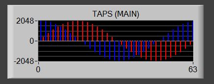
I guess they're not really too thin; I was just hoping for a little less space between the lines:


