- Subscribe to RSS Feed
- Mark Topic as New
- Mark Topic as Read
- Float this Topic for Current User
- Bookmark
- Subscribe
- Mute
- Printer Friendly Page
June 22nd NOCLUG meeting Topic and request for code
06-09-2011 08:45 PM
- Mark as New
- Bookmark
- Subscribe
- Mute
- Subscribe to RSS Feed
- Permalink
- Report to a Moderator
Hi All,
Our next NOCLUG meeting is fast approaching, please sign up as soon as possible to help our planning.
In addition to networking and gorging on pizza, we will be discussing the good, bad and ugly of user interfaces. LabVIEW is a powerful programming language that can create beautiful and elegant user interface designs, or it can make some of the ugliest images to hit your computer screen and sear your eyeballs. So we're going to talk about all the ways to improve our user interfaces from big (thin clients and containers) to small (tooltips, color palettes) and everything in between.
We're also going to do a little bit of show and tell, but we need your help. Please post your good, bad and ugly VI's or screen captures here. We'll highlight some of the good ones, and take some of the bad ones and fix them up during the meeting.
If you prefer not to post VI's publicly, you can send them to either Tom (tom.ferraro@ni.com) or to me (mattwhitlock@phaeron.com).
Thanks for your help and see you in a couple weeks.
Matt
Message was edited by: Matt Whitlock - fixed URL
06-09-2011 08:52 PM
- Mark as New
- Bookmark
- Subscribe
- Mute
- Subscribe to RSS Feed
- Permalink
- Report to a Moderator
To kick things off, here's a UI that has both very good and very bad elements.

(Control Mixer Process.vi, example shipping with LabVIEW)
06-09-2011 09:05 PM
- Mark as New
- Bookmark
- Subscribe
- Mute
- Subscribe to RSS Feed
- Permalink
- Report to a Moderator
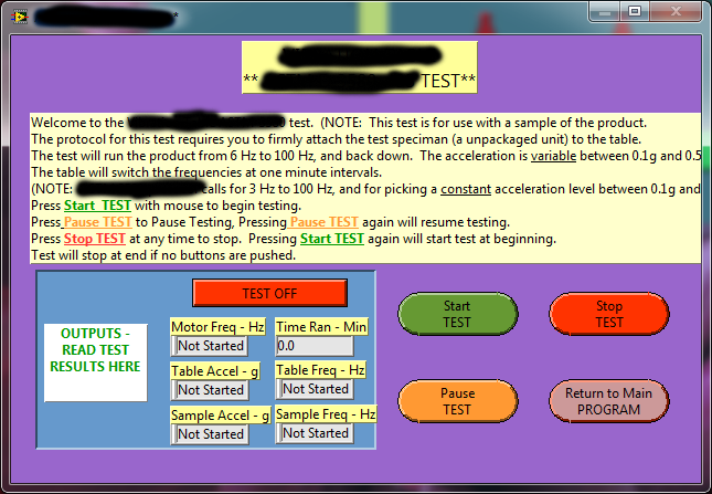
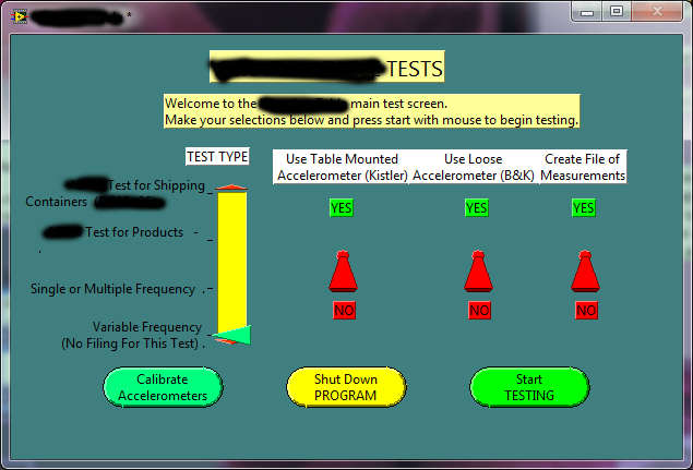
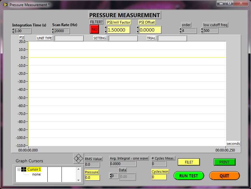
A couple more bad ones, note that these were done a number of years ago, and did not age well. I've also blacked out parts to try to obfuscate where the code came from.


Here are a couple more screenshots, before and after very minor tweaks:


06-20-2011 04:46 PM
- Mark as New
- Bookmark
- Subscribe
- Mute
- Subscribe to RSS Feed
- Permalink
- Report to a Moderator
I had the sign-up URL mal-formed in the original message, but have corrected it. Please sign up if you haven't done so already.
Thanks,
Matt
