- Subscribe to RSS Feed
- Mark Topic as New
- Mark Topic as Read
- Float this Topic for Current User
- Bookmark
- Subscribe
- Mute
- Printer Friendly Page
Bar chart mod/explain help needed
Solved!02-23-2015 10:55 AM
- Mark as New
- Bookmark
- Subscribe
- Mute
- Subscribe to RSS Feed
- Permalink
- Report to a Moderator
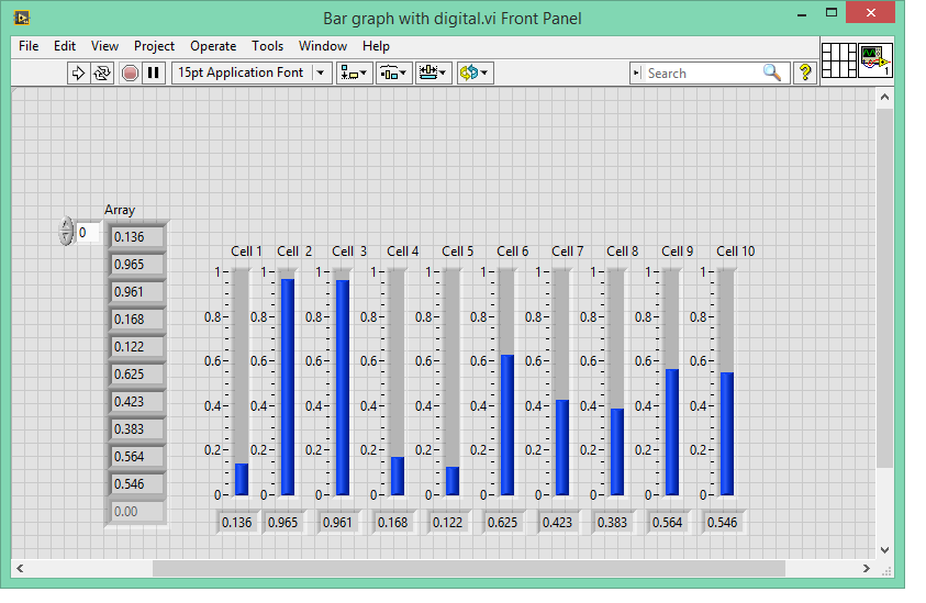
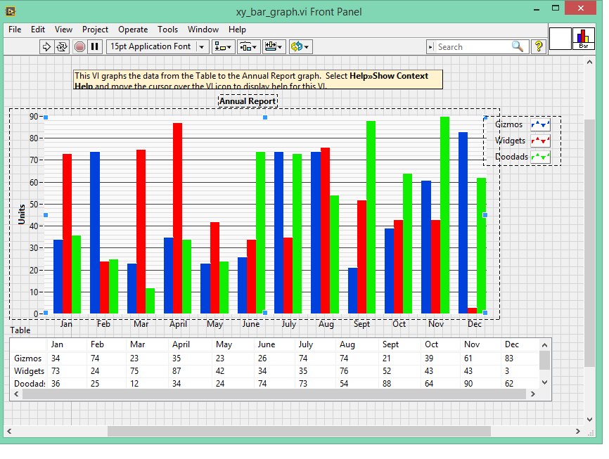
I would to make a bar chart like the xy chart I found but every attempt I’ve made to modify it results in errors I do not understand. Here are the screen shots and the files I am using. I made the simple vertical fill slide indicator and it works fine but I like the XY graph with a single grid background and other properties that come with a graph.
My question is can I even do a bar chart using 30 channels of voltage data on the XY graph? I’ve tried to modify the XY code but I haven’t been successful.
My VI looks like this:

The XY chart looks like this

I have attached both files.
So, I’m asking can the XY _bar_graph be modified to display live data from an analog input scan of 30 channels. As well as an in depth explanation of the XY graph. So I can modify it to display a stream of analog data?
BTW I'm using LV 14 with Win 8.1
Thanks!
JustGene
Solved! Go to Solution.
02-23-2015 12:00 PM
- Mark as New
- Bookmark
- Subscribe
- Mute
- Subscribe to RSS Feed
- Permalink
- Report to a Moderator
So let's proceed gradually. Look at the VI I attached:
- XY Graph shows how to construct a basic bar graph. It only has one plot (plot 0). The properties of plot 0 are set to be an actual bar graph (look at bar plot property and interpolation). To build it it's very easy, just wire an array of X (0,1,2,3..) and an array of Y (random in this case) and bundle them in a cluster before passing them to the graph.
- XY Graph 2 shows how we can add more than 1 plot to an XY graph. We can create a second cluster for the second plot. We can use the same X array, and use a different set of Y values. But problem: the 2 sets are plotted on top of each other, which is not what we want.
- XY Graph 3 shows a solution that could work in theory but actually it doesn't. We offset the X values of the second plot. The X values of plot 0 become 0,2,4,6... while the X value of plot 1 become 1,3,5,7... The problem is that LabVIEW automatically adjust the width of the bars taking into account only the plot itself. So we still see some kine of overlap.
- XY Graph 4 shows what the XY example you attached does. It creates one plot per bar. It no longer set the properties of the plot to be the ones of a bar plot. Instead it uses the Fill To property and use 2 points to draw a rectangle. So if you visualize the data as an array instead of a graph, you'll see that each plot is made of 2 values: [X,Y] and [X+1,Y]. The next plot will be offset by 1: [X+1,Y] and [X+2,Y]. Then we create a gap between X+2 and X+3 by making the next plot (belonging to the "White" series) start at X+3 instead of X+2, and so on.
- XY Graph 5 is basically XY Graph 4 after we color each plot one by one to simulate the 2 series we want.
02-23-2015 09:20 PM
- Mark as New
- Bookmark
- Subscribe
- Mute
- Subscribe to RSS Feed
- Permalink
- Report to a Moderator
Thanks for your time Manudelavega, your explination process has helped me to understand the way the x y graph plots a bar of fixed width (x axis) and variable higth (y axis). Better still, it shows me how that "white" space is inserted by the third increment on the shift register. Now I see that the for loop generates 3 bars on each iteration, 2 bars and a space.
I will experiment with this to get an array of 30 bars, without any spaces, in a for loop of 30 iterations to display 30 channels of analog voltage.
At least now I am armed with a better understanding of this bar charting process.
Thanks again!
Gene
PS
I still think NI should have a bar chart function included in the graphing tool box![]()
Message was edited by: GLLV I consider this question answered but I don't know how to indicate that
02-24-2015 08:51 PM
- Mark as New
- Bookmark
- Subscribe
- Mute
- Subscribe to RSS Feed
- Permalink
- Report to a Moderator
The key to making a bar chart is to make a diagonal matrix. All values not on the diagonal are NaN and thus do not plot. This is a multiplot. There are actually 18 traces overlaid. In this example, after the random data is generated I check each value against some thresholds and apply a corresponding color. The example was written in 2006 and opens fine in 2014 so anything in between should work too.
02-25-2015 06:49 AM
- Mark as New
- Bookmark
- Subscribe
- Mute
- Subscribe to RSS Feed
- Permalink
- Report to a Moderator
Thanks Paul, I was just thinking about the bar color and your example is perfect . The NaN it is an elegant way to construct the bars, using the replace array subset and the index count.
Two questions:
- why use two index?
- Is this how to get the space inbetween the bars?
Great help!
Gene
02-25-2015 07:37 PM
- Mark as New
- Bookmark
- Subscribe
- Mute
- Subscribe to RSS Feed
- Permalink
- Report to a Moderator
Two indexes are needed to access the diagonal element of the array. The
diagonal elements are the only ones that contain data. For everything else
look at the properties of the graph. Play with them. Change them. See what
they do.
In a message dated 2/25/2015 7:50:37 A.M. Eastern Standard Time,
web.community@ni.com writes:
Community (https://decibel.ni.com/content/index.jspa)
Re: Bar chart mod/explain help needed
created by justgene (https://decibel.ni.com/content/people/justgene) in
UI Interest Group - View the full discussion
(https://decibel.ni.com/content/message/94697#94697)
