- Subscribe to RSS Feed
- Mark Topic as New
- Mark Topic as Read
- Float this Topic for Current User
- Bookmark
- Subscribe
- Mute
- Printer Friendly Page
Make XY graph look like waveform chart
Solved!08-30-2020 02:57 AM
- Mark as New
- Bookmark
- Subscribe
- Mute
- Subscribe to RSS Feed
- Permalink
- Report to a Moderator
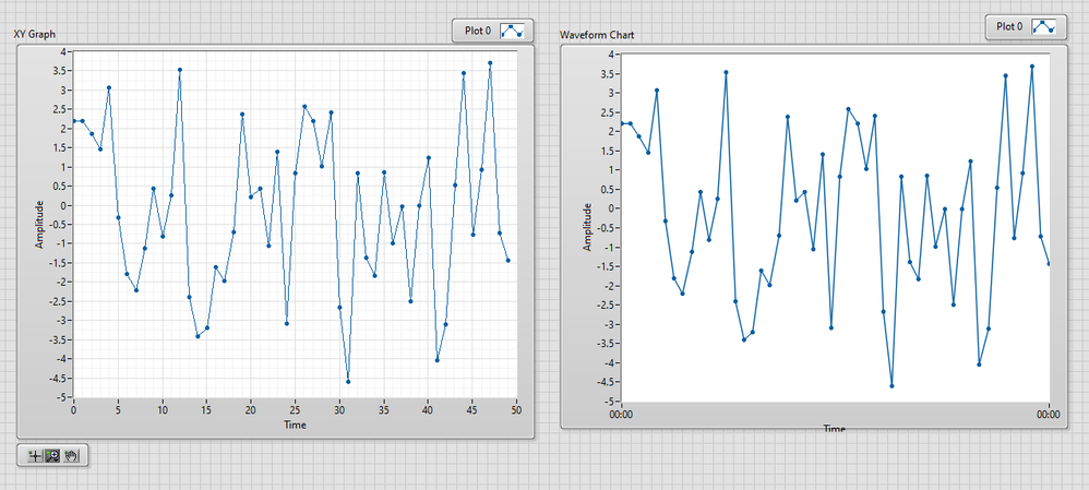
Is it just me or the waveform chart looks a loot better than the XY graph?
Is there a way to make XY graph that looks like waveform chart?
Or to be more precise, how to I get rid of those edges you see in the graph and make look smother like the chart?
Solved! Go to Solution.
08-30-2020 10:50 AM
- Mark as New
- Bookmark
- Subscribe
- Mute
- Subscribe to RSS Feed
- Permalink
- Report to a Moderator
08-30-2020 12:44 PM - edited 08-30-2020 12:46 PM
- Mark as New
- Bookmark
- Subscribe
- Mute
- Subscribe to RSS Feed
- Permalink
- Report to a Moderator
@GerdW wrote:
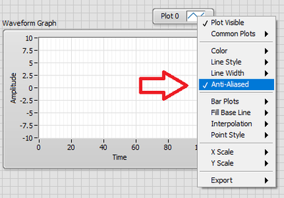
enable aliasing in the plot properties…
And be aware that redrawing will be significantly more expensive, so use it only for simple data with relatively few points. For each point, it needs to proportionally fill adjacent pixels with shades of the line color.
The pixelated lines are more of a problem on low resolution screens, but these are typical for less powerful computers/laptops which should not be overburdened by extra computations. Catch 22. 😉
08-31-2020 02:03 AM
- Mark as New
- Bookmark
- Subscribe
- Mute
- Subscribe to RSS Feed
- Permalink
- Report to a Moderator
Thanks :).
That's what I like about Labview. Even after 10 years of programming with it there are still some hidden buttons I didn't knew about.


