- Subscribe to RSS Feed
- Mark Topic as New
- Mark Topic as Read
- Float this Topic for Current User
- Bookmark
- Subscribe
- Mute
- Printer Friendly Page
Blurred text in icons
Solved!11-07-2013 05:21 AM - edited 11-07-2013 05:23 AM
- Mark as New
- Bookmark
- Subscribe
- Mute
- Subscribe to RSS Feed
- Permalink
- Report to a Moderator
Hello everyone,
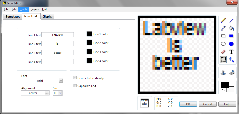
when I write text into icons (almost in every icons), the text appears as blurred, not sharp. There's a kind of shade.
Since the text is minuscle, the final result is not clearly readable.
I tried many fonts but the result is the same.
Does anybody know why and how to make clear text to appear ?
Solved! Go to Solution.
11-07-2013 05:30 AM - edited 11-07-2013 05:33 AM
- Mark as New
- Bookmark
- Subscribe
- Mute
- Subscribe to RSS Feed
- Permalink
- Report to a Moderator
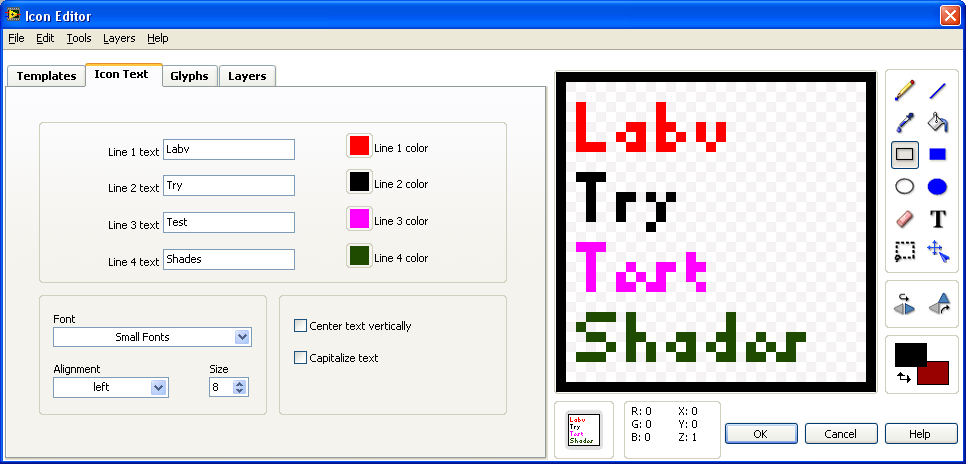
Try the standard font. Even with size 8 i have no problem with any shades:
I also tried some different fonts, the size for the different fonts need be higher. Otherwise it will produc shades like your example.
When you want to use lucida console as in your example the size needs to be atleast 9 to be shown perfectly.
Koen
UnCertified LabVIEW Student
Mistakes are for learning, that's why suggestions are always welcome!
11-07-2013 05:40 AM
- Mark as New
- Bookmark
- Subscribe
- Mute
- Subscribe to RSS Feed
- Permalink
- Report to a Moderator
Hi Koen, and thanks for your attention.
Small Font looks sharp in my editor too, and I am ok just with it.
Anyway, Lucida Console still appears blurred at bigger size.
One should not really need different fonts as the characters are very small.
11-07-2013 05:45 AM
- Mark as New
- Bookmark
- Subscribe
- Mute
- Subscribe to RSS Feed
- Permalink
- Report to a Moderator
11-07-2013 05:52 AM
- Mark as New
- Bookmark
- Subscribe
- Mute
- Subscribe to RSS Feed
- Permalink
- Report to a Moderator
Hi GerdW,
I'm using Windows7 and only in this case the problem appears. Not in WinXP.
In the Windows7 I cannot find the usual font I knew, and the distinction between Truetype or not is not reported anymore.
In XP every font was reasonably well displayed.
11-07-2013 08:51 AM
- Mark as New
- Bookmark
- Subscribe
- Mute
- Subscribe to RSS Feed
- Permalink
- Report to a Moderator
Use glyphs, not text.
11-07-2013 10:41 AM
- Mark as New
- Bookmark
- Subscribe
- Mute
- Subscribe to RSS Feed
- Permalink
- Report to a Moderator
@paul_cardinale wrote:
Use glyphs, not text.
Curious as to why you recommended this. Is it because glyphs are bitmaps? Or are you just repeating the LV mantra about using graphics instead of text for your icons? (It's not meant as a dig, because I use glyphs when practical.)
(Mid-Level minion.)
My support system ensures that I don't look totally incompetent.
Proud to say that I've progressed beyond knowing just enough to be dangerous. I now know enough to know that I have no clue about anything at all.
Humble author of the CLAD Nugget.
11-07-2013 10:52 AM - edited 11-07-2013 11:20 AM
- Mark as New
- Bookmark
- Subscribe
- Mute
- Subscribe to RSS Feed
- Permalink
- Report to a Moderator
This has nothing to do with truetype or font. The "blurring" is due to your windows ClearType settings. and makes it look smoother at the native resolution because it takes advantage of the RGB pixel arrangement of your monitor. See here for details. Of course it will look blurred on the magnified icon but it actually looks better in the correctly sized preview at the bottom (you have 3x the horizontal precision!)
11-08-2013 02:07 AM - edited 11-08-2013 02:09 AM
- Mark as New
- Bookmark
- Subscribe
- Mute
- Subscribe to RSS Feed
- Permalink
- Report to a Moderator
Altenabch has a point here.
It is something related to Clear Type optimisation, I'm using a laptop BTW.
But unfortunately the final result in the small icon is as blurred as in the drawing area.
It seems that the editor draws the characters in the bitmap area of the icon editor, and from that point the icon is just a bitmap, forgetting whatevet picture optimisation (Clear Type) might have been done.
Anyway, as already said, I'm fine with just one font (Small Font). I don't really have the need to play with fancy fonts :).
11-11-2013 09:02 AM
- Mark as New
- Bookmark
- Subscribe
- Mute
- Subscribe to RSS Feed
- Permalink
- Report to a Moderator
I hate text icons. The text is hard to read, and unless you look very closely at the BD, the sub-VIs are hard to distinguish from on another.


