- Subscribe to RSS Feed
- Mark Topic as New
- Mark Topic as Read
- Float this Topic for Current User
- Bookmark
- Subscribe
- Mute
- Printer Friendly Page
Blurred text in icons
Solved!11-11-2013 09:17 AM
- Mark as New
- Bookmark
- Subscribe
- Mute
- Subscribe to RSS Feed
- Permalink
- Report to a Moderator
I like the antialiased fonts, but they have one big problem currently: They always antialias towards white, not the actual background! So, as it stands, either write text in the graphical tool, or dont use antialiased fonts. If it'd work better i'd always use Tratex black. 🙂
/Y
11-11-2013 10:34 AM
- Mark as New
- Bookmark
- Subscribe
- Mute
- Subscribe to RSS Feed
- Permalink
- Report to a Moderator
@Yamaeda wrote:
I like the antialiased fonts, but they have one big problem currently: They always antialias towards white, not the actual background! So, as it stands, either write text in the graphical tool, or dont use antialiased fonts. If it'd work better i'd always use Tratex black. 🙂
Cleartype has many other shortcomings, for example try it on a monitor that can be turned to portrait orientation (or a tablet!). Cleartype will only work in landscape mode of course.
Many companies are now coming out with ultra high resolution notebook screens (e.g. 13.3 inch at 3200x1800!!) where this can be handled much more gracefully. Hardware technology will make this software kludge irrelevant in the future.
Of course pixel based graphics such as the LabVIEW block diagram, front panel, or icon will probably be unusable on something like that at native resolution (we would need to cut down the display resolution settings or use a microscope :o). Has anyone played with this? LabVIEW clearly needs to get away from a pixel based rendering in the future!
11-11-2013 01:26 PM - edited 11-11-2013 01:27 PM
- Mark as New
- Bookmark
- Subscribe
- Mute
- Subscribe to RSS Feed
- Permalink
- Report to a Moderator
Good point, Cleartype will have to revert to full pixel antialiasing if in portrait mode. Still, no matter what the resolution, i think cleartype will stay, as you can always use 3x higher resolution. 😄
You're actually making a good suggestion, if you're not aware of it, texts in icons should stay as a true type text layer and not become a bitmap, maybe icons should be changed to some form of eps so they can scale regardless of resolution? Now this would be more of a windows suggestion than LV, but the text idea might be possible to implement.
(Tratex being the font used on Swedish road signs, i downloaded it and tried it in the icon editor and really liked the result)
/Y
02-19-2015 02:21 AM
- Mark as New
- Bookmark
- Subscribe
- Mute
- Subscribe to RSS Feed
- Permalink
- Report to a Moderator
This has to be a bug. I have attached a VI that uses the LabVIEW Icon API to type some text. I tested in LabVIEW 2010, 11, 12, 14 and the text always uses white for background instead of transparent. If it would have used transparent for background, the text would have rendered correctly.
This can be corrected if you open "lv_icon.lvlib:draw Picture based on Origin.vi" and bypass "lv_icon.lvlib:Apply Transparency.vi" . The transparency will be correct and the font will be correctly rendered, independent of background color.
For LV2011+, you will need to downloaded the source files for the Icon API to be able to change it.
The attached image shows the difference between white and transparent as background for the text. It's such a huge difference. I searched the forums but could not find a CAR for this.
02-19-2015 08:34 AM
- Mark as New
- Bookmark
- Subscribe
- Mute
- Subscribe to RSS Feed
- Permalink
- Report to a Moderator
It just looks like the other stuff to me - a rasterized cleartype font.
(Mid-Level minion.)
My support system ensures that I don't look totally incompetent.
Proud to say that I've progressed beyond knowing just enough to be dangerous. I now know enough to know that I have no clue about anything at all.
Humble author of the CLAD Nugget.
01-09-2016 01:11 AM - edited 01-09-2016 01:12 AM
- Mark as New
- Bookmark
- Subscribe
- Mute
- Subscribe to RSS Feed
- Permalink
- Report to a Moderator
hello
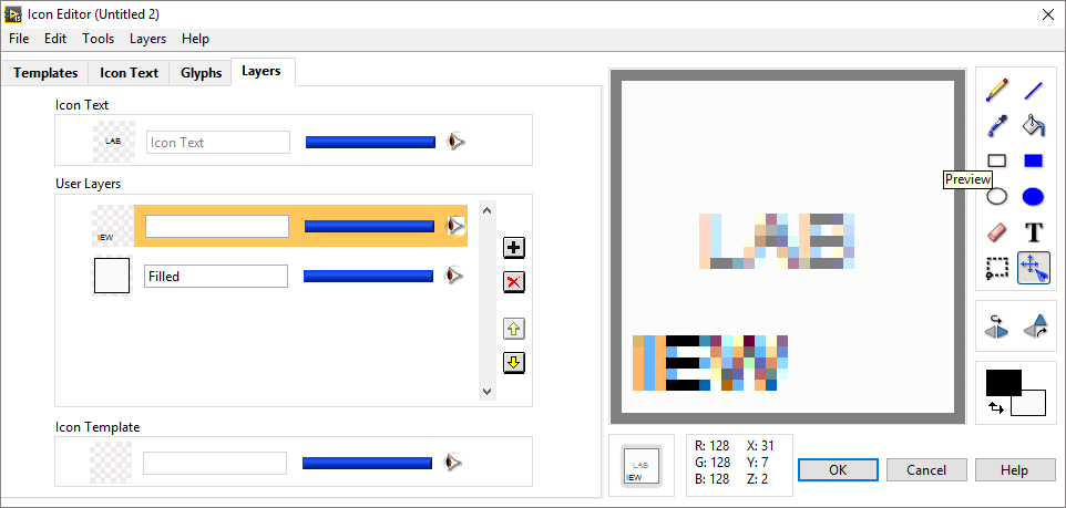
did anyone solve the problem? Recently my icon editor text got blurry and even after reinstalling Windwos & Labview the problem remains on fresh Windows copy!!!
I have Windwos 10 pro updated & Labview 2015 f2 (the newest stuff), Intel HD graphic card.. The problem occured suddenly in the beggining of the new year. maybe because of some windows update or graphic card update. I don't know exactly.
Problem happens on Labview 2015 and Labview 2014SP1. It doesn't matter if i use cleartype or not in windows. It is no matter which font i use in Icon Editor. All of them are blurry! (see attched picture).
Additional issue is that when i enter the text and it is too long for the icon the text is not hidden under the icon frame but immediately cut.
01-09-2016 08:35 AM
- Mark as New
- Bookmark
- Subscribe
- Mute
- Subscribe to RSS Feed
- Permalink
- Report to a Moderator
Make sure you have the same font style in both positions - attachment.
01-09-2016 08:45 AM
- Mark as New
- Bookmark
- Subscribe
- Mute
- Subscribe to RSS Feed
- Permalink
- Report to a Moderator
i have the same fonts since first labview installation but it is not the case
01-09-2016 06:27 PM - edited 01-09-2016 06:29 PM
- Mark as New
- Bookmark
- Subscribe
- Mute
- Subscribe to RSS Feed
- Permalink
- Report to a Moderator
LabVIEW uses "small fonts" for the icon by default. Is that what you are using? Just about anything else you use will be some sort of anti-aliased font which, I guess, becomes rasterized when applied to the icon. That's why it looks like that.
(Mid-Level minion.)
My support system ensures that I don't look totally incompetent.
Proud to say that I've progressed beyond knowing just enough to be dangerous. I now know enough to know that I have no clue about anything at all.
Humble author of the CLAD Nugget.
01-12-2016 06:27 AM
- Mark as New
- Bookmark
- Subscribe
- Mute
- Subscribe to RSS Feed
- Permalink
- Report to a Moderator
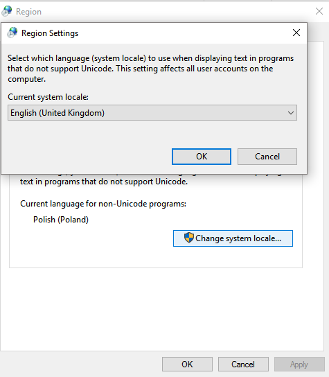
The problem in my sitiution is that I have to use English system locale for non-unicode programs (instead of my local language Polish). I do not understand it, but after i changed it, the icon editor starts to operate normally...
of course in Icon Editor i can use only Small Fonts. The other fonts are still blurry.


