LabVIEW Idea Exchange

cancel
Showing results for 
Search instead for 
Did you mean: 
PJM_Labview

Remove unnecessary mouse click in the "Save As" dialog

Status: New

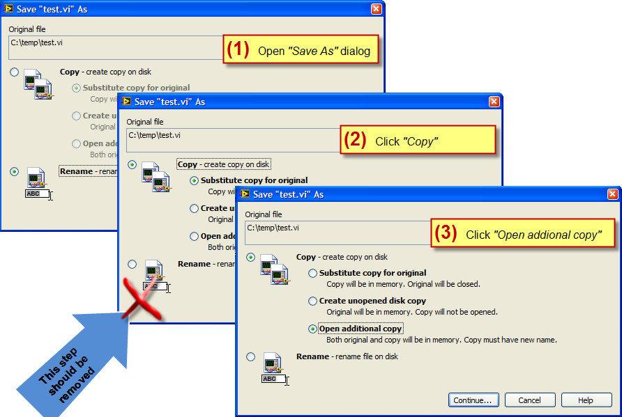
The "Save As" dialog does remember the last selection (this is nice). But sometime when going from "Rename" to any "Copy" operation there are one too many click.


This is what you have to do if you want to go from "Rename" to "Copy>>Open additional copy".


9-29-2010 3-44-02 PM.png


Instead this is what you should be able to do.


9-29-2010 3-08-58 PM.png


This is fairly minor (and a low hanging fruit) but this will improve usability.


vipm.io | jki.net

7 Comments
AristosQueue (NI)
NI Employee (retired)

The current default selection was chosen after various user interviews of what copy operation was most commonly desired. Substitute Copy For Original is the general behavior of Save As in most other applications, and that consistency appeared to influence people's feelings that that should be the default behavior for Save As.

PJM_Labview
Active Participant

Hmm, I guess my idea description is not clear.

I am not advocating changing the default value (which is just fine). I am just suggesting that clicking on any of the 3 disabled copy option should automatically enable the parent "Copy" node along with the specific copy option selected (hence saving one click).

Currently if "rename" is selected and you want a copy option, you have to first click "Copy" then select the copy option you want (if this is not the default one) --> 2 Click.


To summarize this: I am fine with keeping all the existing behaviors, but just add a new one (behavior) where clicking on a disabled copy option will enabled it in one click (withouth having to click the parent "Copy" first).


I hope this clarify this a bit.


vipm.io | jki.net

Intaris
Proven Zealot

Replace the two-level radio button selection list with a flat list.  Seems to be a no-brainer.

AristosQueue (NI)
NI Employee (retired)

Ah. Got it.


> Seems to be a no-brainer.


Nothing about this dialog is a no brainer. No other application I've ever seen has to have this much complexity when dealing with Save As, and the current dialog took way more effort to design than I would've expected. The folks that worked on it took a long time to find something that users weren't thoroughly confused by. This and the "Save Changes" dialog -- places in LV where it is easy to go terribly wrong in usability.


I think this is an interesting idea, but a long way from something that I'd change without a lot of UI prototyping and user feedback.

Intaris
Proven Zealot

Well I don't see how a two-click selection process is better given that all of the options are displayed at any one time (even if they are greyed out).


SImply changing the behaviour so that selecting one of the "copy" sub-items automatically also selects the parent seems to be a perfectly logical and intuitive way of doing things.  But of course there are different types of people using LV so I'd imagine NIs exposure to this would be different to mine.

AristosQueue (NI)
NI Employee (retired)

It's a behavioral change that would go against the style guide of nested radio buttons. MS and Apple style guides say nested options should be grayed out until the top level option is chosen. I don't know the whys and wherefores behind that rule, but I presume it has to do with comprehension of complex options sets, and the last thing that dialog needs is lower comprehension.


Again, I'm not saying it's a bad idea, just that it would require some usability testing in front of new users.

PJM_Labview
Active Participant

I did not even know that there was a style guideline for nested radio buttons (since I don't recall having seen this anywhere except in LabVIEW).

Out of curiosity I tried to look it up and I found is this page from Microsoft msdn website (http://msdn.microsoft.com/en-us/library/aa511488.aspx) that say that this should be avoided (nesting radio button).


msdn:
Avoid nesting radio buttons with other radio buttons or check boxes. If possible, keep all the options at the same level.

Alternatively, I got a document from Adobe where they treat them as tree node (which are collapsed per default when not selected). This is bad in my opinion since you have no clue that there are sub node. There is an example here: http://www.brentlamborn.com/examples/nestedradiobuttons/


In any case, I guess I am getting a bit off track.


vipm.io | jki.net