LabVIEW Idea Exchange

cancel
Showing results for 
Search instead for 
Did you mean: 
MichaelAivaliotis

Add an "Explain Error" pop-up menu on the conditional error probe

Status: New

Add an "Explain Error" pop-up menu on the conditional error probe.

The Generic Probe has this, why not the Conditional Probe?


Generic Probe:

10-9-2009 5-24-12 PM.png


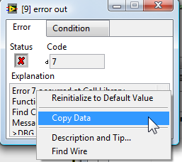
Conditional Probe: 


10-9-2009 5-20-20 PM.png 

Message Edited by Michael Aivaliotis on 10-09-2009 05:27 PM


Michael Aivaliotis
VI Shots LLC
6 Comments
Matthew_Kelton
Active Participant
If you look at the Conditional Probe, the string IS the explanation (not source as in the Generic Probe).  The text in the COnditional Probe is the same text that is displyed in the Explain dialog.  That's why it is not there.
MichaelAivaliotis
Active Participant
Now that you mention it, you are right. However, how am I suppose to know this from the UI? Both probes look exactly like the standard error cluster. The only difference being the conditional. Yes, the text says Source in one and Explanation in the other, but from a visual perspective in my mind they are both identical.


Michael Aivaliotis
VI Shots LLC
PJM_Labview
Active Participant
Eventhough the text is already there (which is not obvious), it is a lot easier to read in the "explain error" dialog that in the small error probe.


vipm.io | jki.net

AristosQueue (NI)
NI Employee (retired)

> Even though the text is already there (which is not obvious), it is a lot

> easier to read in the "explain error" dialog that in the small error probe.


Oh.... PJ... I hear you saying that you want a larger probe? *evil grin* 1024x768 error probe work for you? We can do that...


On a more serious note:


> Yes, the text says Source in one and Explanation in the other, but

> from a visual perspective in my mind they are both identical.


Any suggestions on differentiating? Making the word "Explanation" red and blinking is probably not the way to go, but there's not much to that to make it more differentiated.

Matthew_Kelton
Active Participant

Michael:


It took me forever to realize it myself.  I, like you, was saying to myself "where is the menu item?"  I agree that it is not very clear.


Aristos:


I think you just need it to look less like the standard.  You have all the cluster elements laid out in basically the same layout, so it is easy to not realize that the conditional dialog has the info in it already.  Making the text bloxk larger may help, or dropping the error code (since it is in the string).  Maybe even dropping the error boolean and using a red background would make it look more unique.


Or, just add the menu option and change it to source from explanation.

PJM_Labview
Active Participant

> Oh.... PJ... I hear you saying that you want a larger probe? *evil grin* 1024x768 error probe

> work for you? We can do that...


Good One 🙂


vipm.io | jki.net