View Ideas...
Labels
-
Analysis & Computation
297 -
Development & API
2 -
Development Tools
1 -
Execution & Performance
1,004 -
Feed management
1 -
HW Connectivity
113 -
Installation & Upgrade
264 -
Networking Communications
181 -
Package creation
1 -
Package distribution
1 -
Third party integration & APIs
279 -
UI & Usability
5,379 -
VeriStand
1
Idea Statuses
- New 2,978
- Under Consideration 11
- In Development 1
- In Beta 0
- Declined 2,629
- Duplicate 708
- Completed 327
- Already Implemented 113
- Archived 0
Turn on suggestions
Auto-suggest helps you quickly narrow down your search results by suggesting possible matches as you type.
Showing results for
Options
- Subscribe to RSS Feed
- Mark as New
- Mark as Read
- Bookmark
- Subscribe
- Printer Friendly Page
- Report to a Moderator
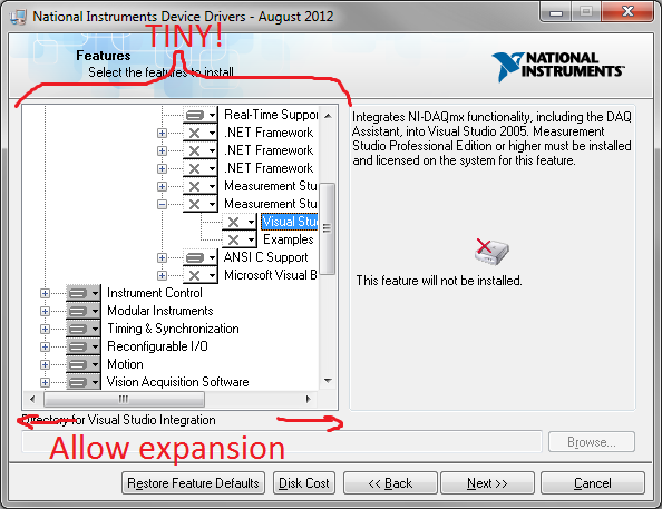
Expand (or allow expansion of) NI software installer GUI
Submitted by
 JKSH
on
02-12-2013
08:52 PM
16 Comments (16 New)
Status:
New
The list of available LabVIEW modules and device drivers is very long. Their names tend to be long too, which is compounded by the many levels of nesting. Modern screens are large.
Given all that, why are we selecting software components by scrolling around a tiny window which can't be expanded?
(Note: most of the trees above aren't exen opened yet!)
Proposal: Make the window bigger (vertically and horizontally), or resizeable, or both.
Thanks for listening!
Labels:
16 Comments
You must be a registered user to add a comment. If you've already registered, sign in. Otherwise, register and sign in.

