-
Analysis & Computation
297 -
Development & API
2 -
Development Tools
1 -
Execution & Performance
1,003 -
Feed management
1 -
HW Connectivity
112 -
Installation & Upgrade
264 -
Networking Communications
181 -
Package creation
1 -
Package distribution
1 -
Third party integration & APIs
278 -
UI & Usability
5,374 -
VeriStand
1
- New 2,989
- Under Consideration 1
- In Development 3
- In Beta 0
- Declined 2,625
- Duplicate 705
- Completed 324
- Already Implemented 113
- Archived 0
- Subscribe to RSS Feed
- Mark as New
- Mark as Read
- Bookmark
- Subscribe
- Printer Friendly Page
- Report to a Moderator
Truncate Long Paths
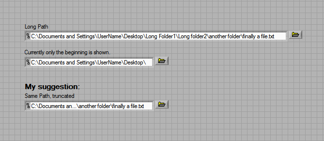
I don't like the way that long file paths are shown in path controls and indicators: If the path is longer than the textbox (and it usually is!), the user only sees the first several levels that fit. This can be pretty confusing.
One way to solve this issue is to truncate the path in the middle in such a way that the filename or last folder (which is usually what's most important) is always shown. I've seen this in other UIs and it should be a natural thing for users to understand.
Here's an illustration:

I think this should be a built in feature of the path controls and indicators, accessible through right-click menus and/or the properties menu of the control at edit time.
CLD
You must be a registered user to add a comment. If you've already registered, sign in. Otherwise, register and sign in.
